


20 Best AI App Marketing Tools In 2026
Boost app growth with the 20 best AI marketing tools of 2026. Master ASO, automate retention, and scale faster with expert picks for indie devs and growth teams
To design high-converting paywalls, start by understanding how top apps design their paywall experience, create multiple variations, A/B test them, and launch the best performer.
However, going through real app paywall designs and collecting them manually can be exhausting. That’s why you can use AppLaunchpad’s UI/UX research tool to find real high-converting paywall designs in one search and use them as inspiration for your own.
Apart from studying top iOS app paywall designs, there are a few key points that you should keep in mind to design high-converting paywalls. So, let’s cover the different types of app paywall designs out there, key elements of high-converting paywalls, and how AppLaunchpad helps you in designing your app paywall.
An app paywall screen is the visual interface inside a mobile application that prompts users to pay, usually via a subscription or one-time purchase, to unlock the app’s premium features, content, or full functionality.
Here are a few reasons why mobile app paywall designs matter.
Before diving into the key elements of a high-converting paywall design, let’s have a look at the different types of app paywall designs out there.
| Paywall Type | How It Works | Best For | Key Advantage |
| Hard Paywall | Locks all content and features until the user subscribes. | Apps with established authority or one core functionality | Filters casual users and prompts an immediate purchase decision |
| Metered Paywall | Gives users a fixed amount of free usage before asking them to subscribe. | News apps and AI tools | Lets users experience the product before paying |
| Adblock Paywall | Gives users an ad-free experience in exchange for a subscription. | Streaming and ad-supported apps | Gives users a clear reason to pay for an uninterrupted experience |
| Dynamic Paywall | Changes the design, messaging, timing, or pricing based on user behavior. | Health, fitness, and streaming apps | Personalizes the paywall based on user readiness to subscribe |
| Freemium Paywall | Offers the core app for free while locking premium features behind a subscription. | Apps with free and premium features | Lets users use the product before deciding to upgrade |
| Registration Paywall | Appears when users enter their personal information during onboarding or setup. | Apps where registration happens early in the user journey | Uses the momentum of a new user to encourage conversion |
Hard paywalls are app paywall designs that don’t provide any free content of the app. They put all content and features behind a paywall and don’t let you move forward without paying for a subscription.
Hard paywalls are some of the most high-converting paywall designs because they immediately filter out low-intent or casual users and force a purchase decision right after onboarding. According to the State of Subscription Apps 2026 report, hard paywalls convert 10.7% of the people who download the app into paid subscribers.
Despite being one of the most high-converting paywall designs, Hard paywalls are not for every app out there. They are only useful when an app already has established authority or offers only one core functionality.
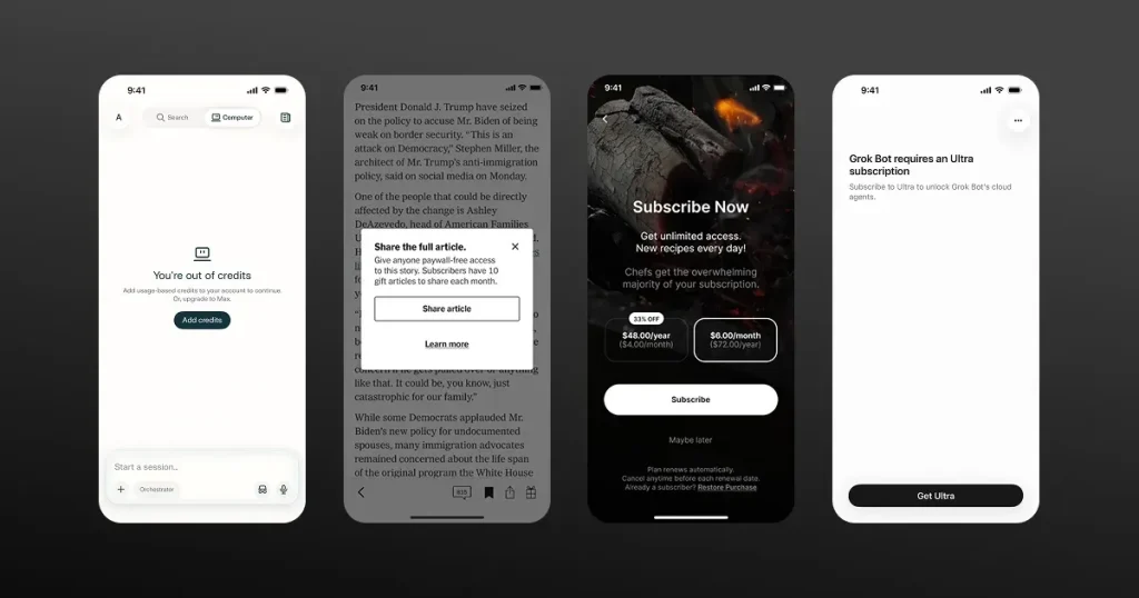
Metered paywall is another high-converting paywall design that gives users a fixed quota of free items, like 3 free AI queries or image generations in a day, and asks users to subscribe to the paid plan to access the complete feature.
This lets users get an experience of what the app is about and how it benefits them before being asked to pay for the rest, making them more likely to subscribe if they find the results satisfactory.
Metered paywalls work best for news apps and AI tools, as they can limit access by usage, such as a fixed number of articles or AI requests, while letting users experience the core product before asking them to subscribe.
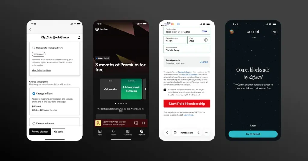
Adblock paywalls are mobile app paywall designs that give users access to an ad-free experience of an app. Most apps make money either through subscriptions or ads, and there are some apps that offer ads only in their free tier or basic tier, prompting users to pay a free to remove ads.
Examples of Adblock paywalls include streaming apps like Spotify or YouTube that offer content for free or in a basic tier but also offer a subscription model to remove ads completely.
Adblock paywalls are one of the most high-converting paywall designs, as ads are often intrusive, interrupt the user experience, and give users a clear reason to pay for an uninterrupted, ad-free experience.
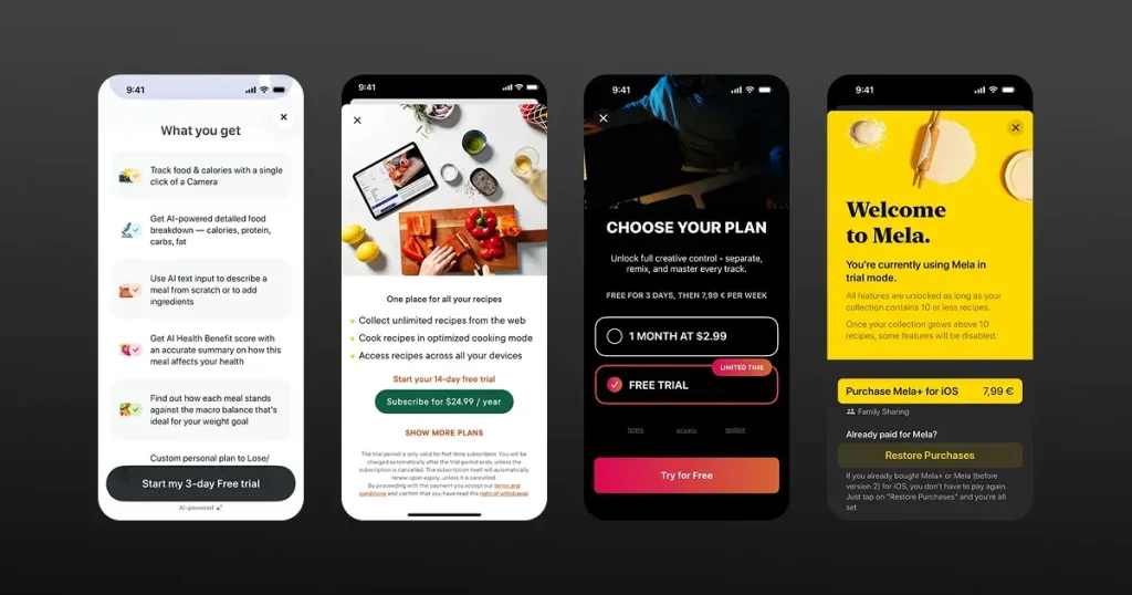
Dynamic paywalls can improve conversions by changing their design and messaging based on how users interact with the app.
So, instead of showing a similar kind of app paywall design to every user, they change the design, messaging, timing, and pricing to match user readiness to pay for the premium features.
Dynamic paywalls work best for health and fitness apps or streaming apps, where health and fitness apps can show you the paywall when you complete a certain milestone, and streaming apps can put any movie or content behind their paywall.
One example is the Calm app, which, when it senses that a user primarily uses the app for nighttime Sleep Stories, changes the visual imagery of its paywall to show a nighttime scene that matches their sleep-focused use case.
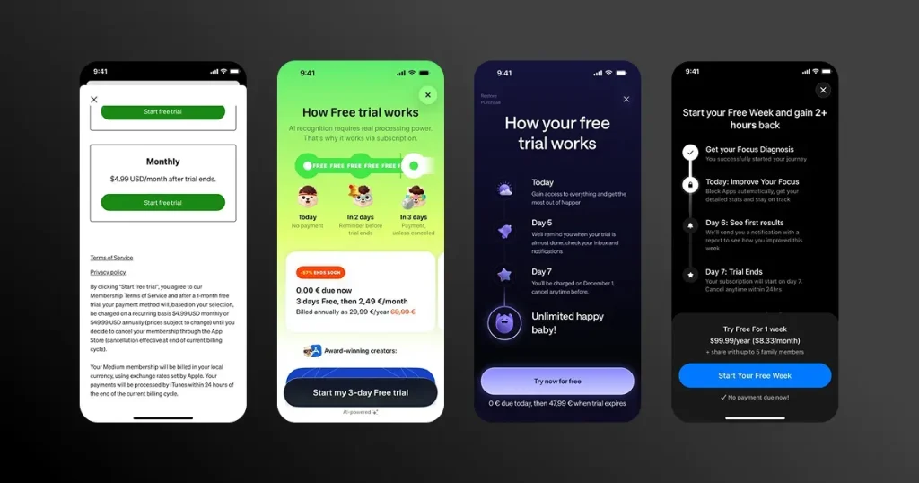
There are apps that offer a completely free experience. However, some of their best features are locked behind a paywall, and that app paywall design is called a freemium paywall.
Examples of freemium paywalls include apps like Spotify and social games like Candy Crush, where you can stream and play, but uninterrupted music and extra lives cost money.
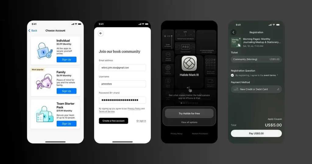
Registration paywalls appear when users sign up for an app, asking them to create an account or share personal details before accessing its features. This gives apps an opportunity to introduce premium benefits during onboarding, but asking for too much information too early can cause users to drop off.
Although a mobile app paywall design consists of multiple design elements, here are a few key elements that have the highest impact in increasing user conversions.
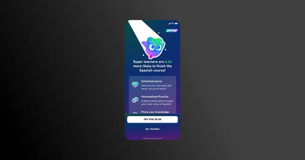
If you want to design a high-converting paywall, your on-screen copy needs to prioritize clarity over creativity. The text on your app should give users a clear idea of what they will get if they pay for the subscription and how it improves their lives.
Having clarity removes any doubt the users might have regarding your app’s features and increases their trust by allowing them to visualize a tangible result.
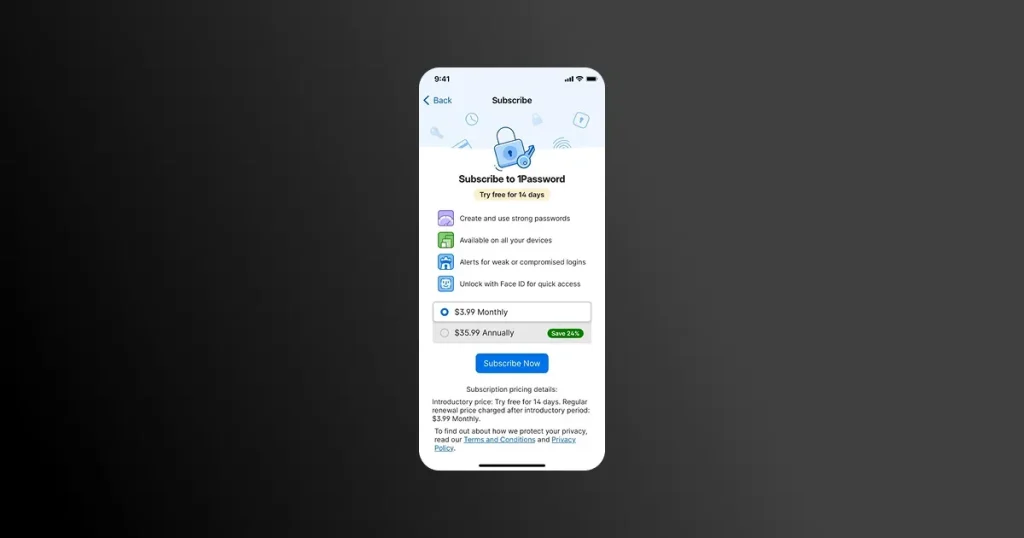
Pricing transparency is another key factor in designing a high-converting paywall. You should clearly mention all the plans that are available to the user and exactly how these plans are different from each other.
Moreover, you should also mention which plan is best for which kind of user. This removes decision fatigue by helping users quickly identify the plan that best matches their needs, rather than making them compare every option themselves.
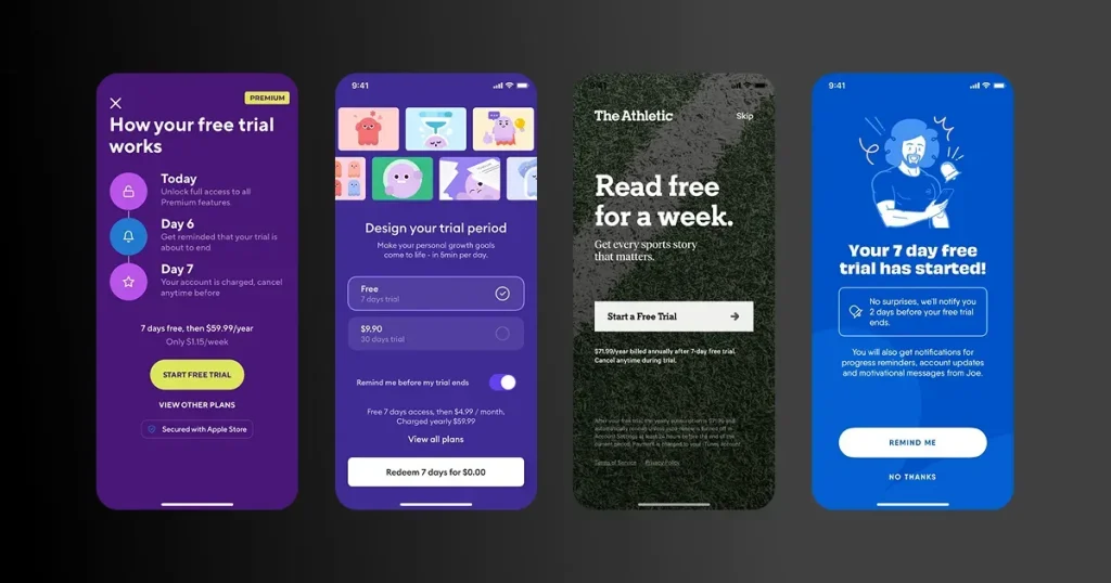
Apps that offer a free trial, no matter how small, often receive better paywall conversions, as it removes any friction from the side of the user, as they can experience the premium features of an app without any financial risk.
This also improves trust and makes the upgrade feel less like a purchase and more like keeping access to something the user has already experienced and come to value.
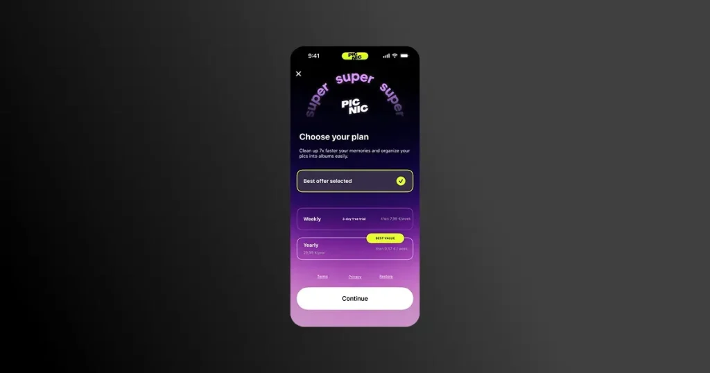
Having a clear visual hierarchy can guide users to subscribe to the recommended plan instead of the cheapest available option. App designers use various techniques to create a strong visual hierarchy, some include having a distinct border on the recommended plan or highlighting it with the Best Value badge.
Creating a strong visual hierarchy is crucial for a high-converting paywall design as it reduces the effort users need to scan the screen and makes the subscription decision easier to understand.
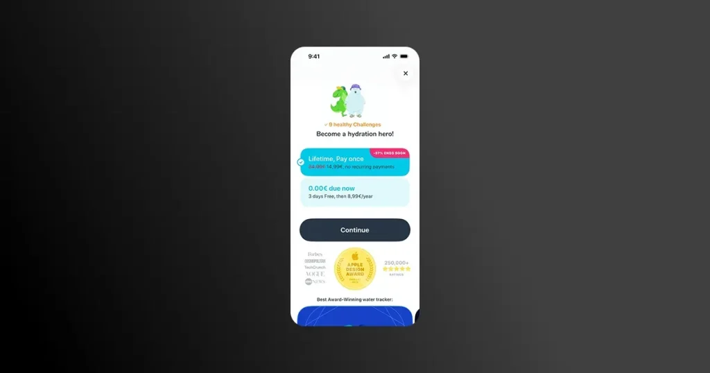
The CTA button is where the final conversion happens. If you nail it you make the purchase design feel like a breeze for the user, and if you miss it, your conversions will dip no matter how good your design is.
To design a high-converting paywall, avoid generic phrases like ‘Subscribe Now’ and use action driven CTA like ‘Get Uninterrupted Streaming’ or any phrase relevant to the app, as it clearly communicates what the user gets after tapping the button.
Let’s look at some proven paywall structures and how popular apps use them.
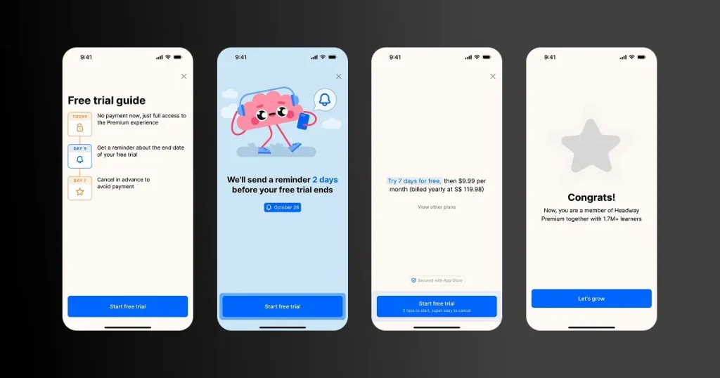
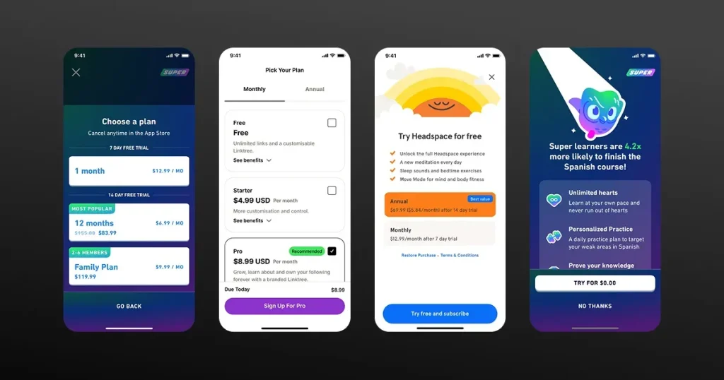
Trial-focused paywalls dominate because they let users test the app and let developers show its features. This also removes the perceived risk of a subscription from the user’s end because they offer a clear timeline, cancellation reassurance, transparent pricing, and simple plan selection. Apps like Duolingo and Meta use this.
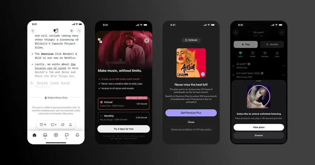
Product preview app paywall design locks content, showing you a glimpse of what it offers, so instead of explaining its features, it just shows them. For example, an analytics app allows users to see the first few search results and blurs out the rest, increasing the curiosity of the user, making them more likely to subscribe.
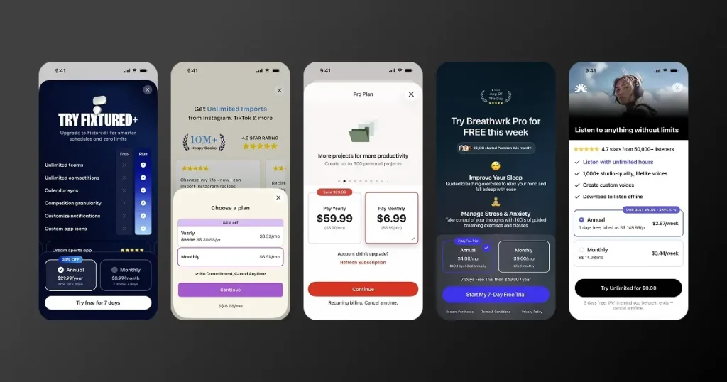
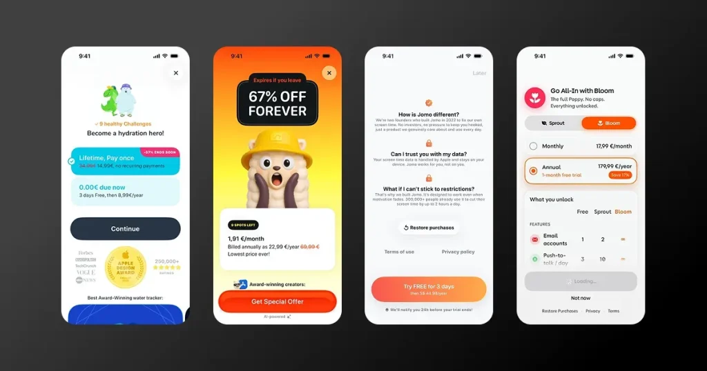
When designers want users to subscribe to their annual plan rather than the monthly subscription, they use this type of paywall. Here, framing is key. For example, a $59 yearly plan sounds expensive, but comparing it with a $9.99 monthly plan and saying you can save 50% encourages users to subscribe.
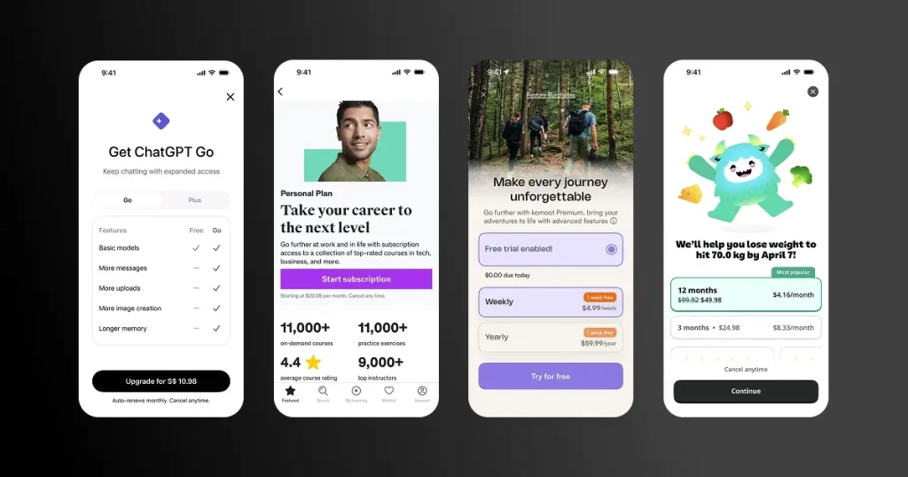
Users don’t read the full features behind a paywall. They scan and decide, and one CTA reduces decision fatigue by shifting the choice from which plan to which plan to whether to subscribe. Some may find this restrictive, but it works well in a lot of apps like ChatGPT and Udemy.
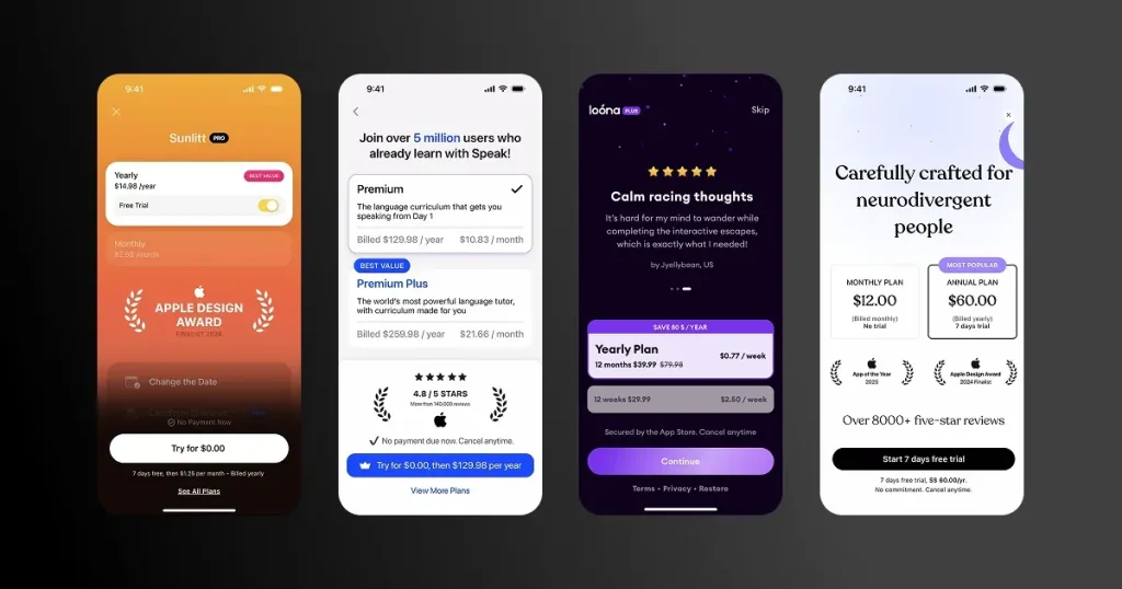
Social proof paywalls remove subscription risk by letting users try the app’s premium features before deciding whether to subscribe. Apps like Speak, Sunlit, and Loona use this paywall design structure.
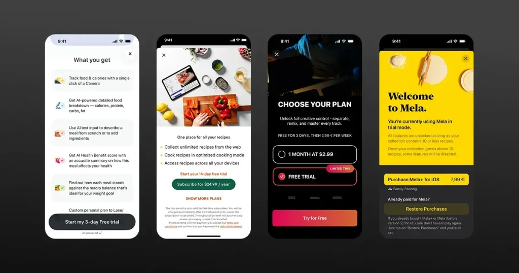
If you show paywalls at the wrong time, conversion rates will dip. Top apps understand that and design their paywalls to show when users complete a specific task, hit a milestone, or reach a limit. This gives them a prompt to subscribe without any aggressive tactics.
Follow this step-by-step guide to design high-converting paywalls for your app.
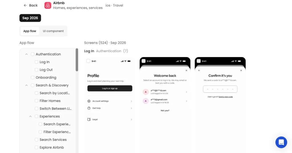
Sign in to AppLaunchpad and study the paywall designs of top apps. Collect all the paywall screens you like into a Figma canvas and create a moodboard that would form the base of your designs.
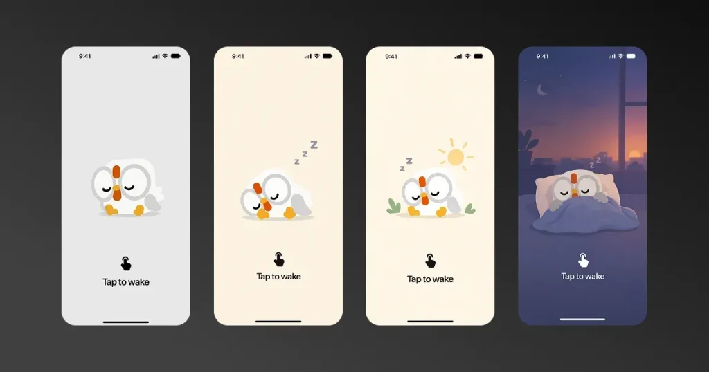
Start designing your app paywall screens. Create multiple variations of the paywalls based on the design inspiration you collected. Change the copy, structure, and elements, and create different paywall screens.
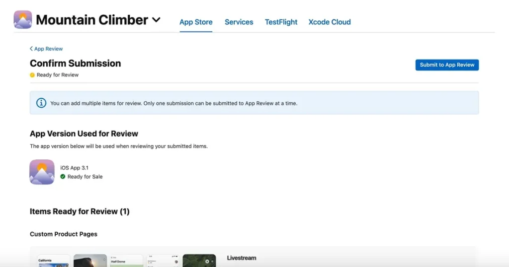
Launch the paywall to a small group of users before making it available to everyone. This lets you see how real users interact with the paywall and whether they face any issues. You can use their feedback and early conversion data to make changes before the full launch.
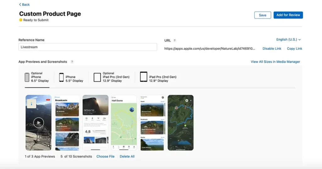
You can create Custom Product Pages and A/B test different paywalls by sending the audience directly using the custom links to see which one converts better.
Even after you find the best-converting paywall design, don’t stop. Periodically make changes to your paywalls and see what sticks. Consistently run A/B tests and improve your user experience and conversion.
AppLaunchpad is an app store screenshot generator, but it also offers an app UI/UX research tool that has a good collection of real app design screens, user flows, and UI elements. The tool also allows users to search for any particular user screen or user flow.
So, during your moodboarding process, you can find real app paywall designs, copy them directly to Figma using AppLaunchpad’s Figma plugin, and have reference points before you start your app design process.
Even if you create one of the best app paywall, it might not convert that well for you if you make these mistakes.
Designing a high-converting paywall is not that difficult if you follow the right process and tools. All you need to do is study how popular apps design their app paywall, understand the psychology behind it, and implement the same for your app.
That’s why AppLaunchpad is the best UI/UX research tool for you, as you can study high-converting paywall designs of popular apps, take notes, and create something similar for yourself with ease.
You can search, filter, and view real paywall screens to understand how leading apps structure their offers, present pricing, highlight premium benefits, and guide users toward the subscription decision.
There is no right number of pricing plans a mobile app paywall screen should have. A high-converting paywall should offer enough pricing options to cover different user needs without creating decision fatigue.
A high-converting paywall makes users more likely to subscribe by clearly showing the benefits of upgrading, offering easy-to-understand pricing, and using a compelling CTA that encourages them to take action.
The best CTA depends on what the user gets after tapping it. Instead of generic text like ‘Subscribe Now,’ use action-driven copy such as ‘Start Free Trial,’ ‘Unlock Premium,’ or ‘Get Unlimited Workouts’ that makes the benefit clear.
If you want to test your iOS app paywall design, create multiple versions of your paywall using Custom Product Pages and A/B test elements such as pricing, trial length, plan selection, copy, imagery, layout, and CTA.
A free trial on an iOS app paywall design can reduce the perceived risk of subscribing by letting users experience premium features before paying, but the right trial length and whether you should offer one depends on your app and how quickly users can experience its value.


