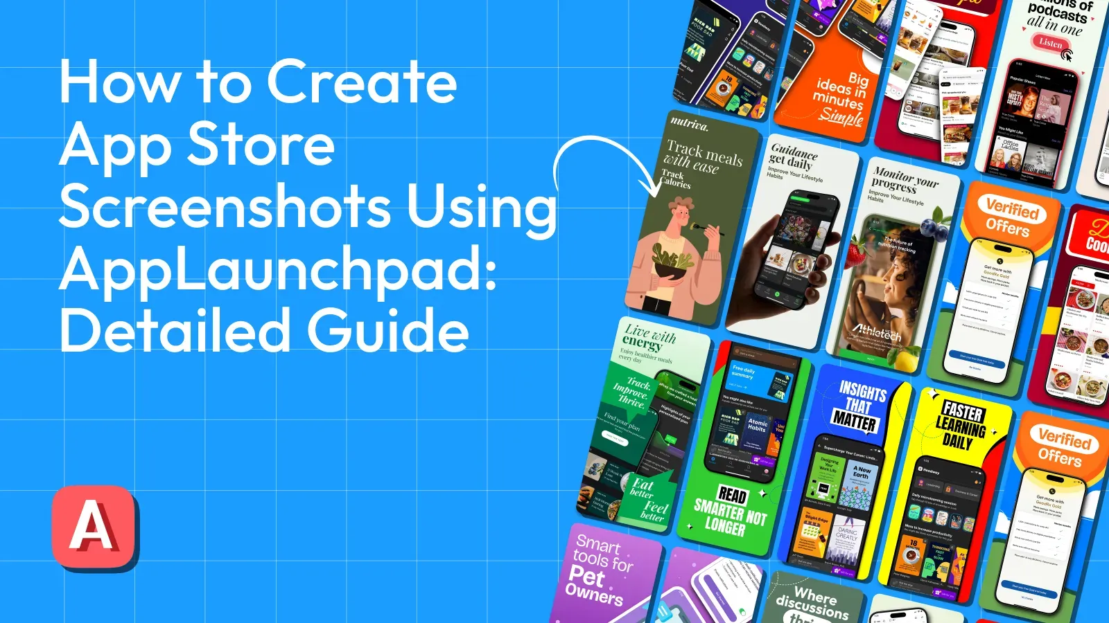
How to Create App Store Screenshots Using AppLaunchpad: Detailed Guide
How to Create App Store Screenshots Using AppLaunchpad: Detailed Guide
A complete guide to creating App Store screenshots with AppLaunchpad, including steps, requirements, and common mistakes to avoid

When users visit your App Store page, App Store screenshots often decide what happens next. Most people don’t read descriptions right away. They scroll, swipe, and judge fast. If your App Store screenshots are unclear or boring, even a great app can get ignored.
This guide is curated for developers, founders, and product teams who want to create App Store screenshots without dealing with complex design tools like Figma and Photoshop. By the end of this blog, you’ll know different ways to create screenshots, understand App Store screenshot requirements, and a detailed workflow using an App Store screenshot generator like AppLaunchpad.
What Are App Store Screenshots and Why They Matter
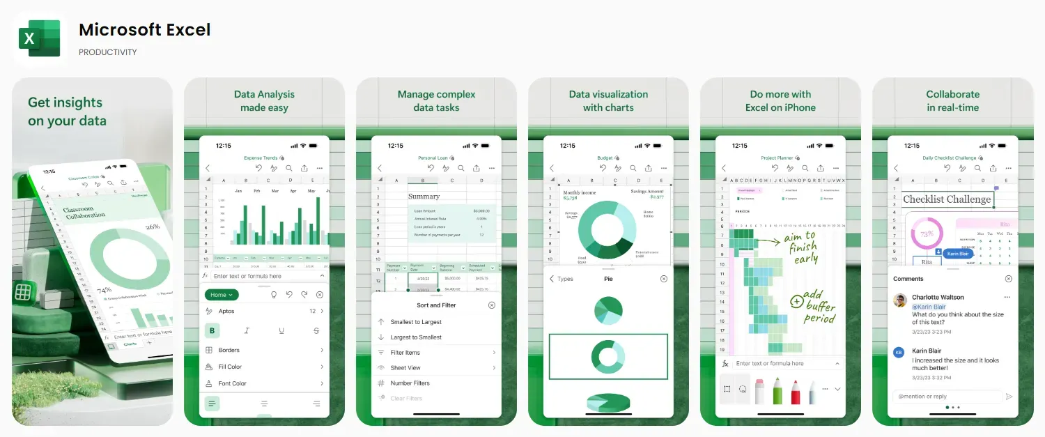
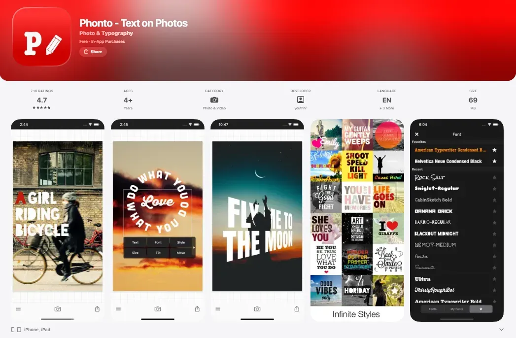
App Store screenshots are visual previews of your app that appear on your App Store listing. They show your app’s interface, features, and value. For most users, App Store screenshots create the first impression. Good App Store screenshots help users quickly understand what your app does and why it’s useful.
High-quality App Store screenshots:
strongly influence clicks
Affect scroll behavior
Increase conversions.
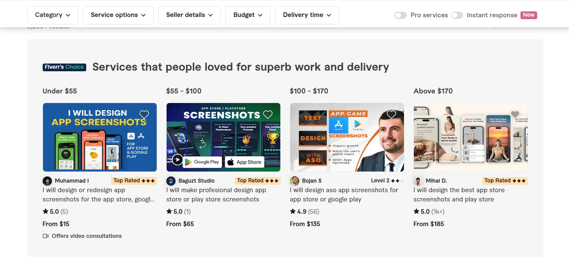
App Store screenshots also appear in search results, ads, and custom product pages, which makes App Store screenshot design a critical part of your listing.
Different Approaches to Creating App Store Screenshots
There are multiple ways to create App Store screenshots. Each approach fits different teams, budgets, and workflows.
Take screenshots manually
Capturing screenshots directly from your app is the most basic way to create App Store screenshots. Developers usually use the Xcode Simulator on macOS or take screenshots on a real iPhone device. This approach shows the real UI without any visual changes, which can be helpful during early development or internal reviews.
The main limitation is clarity. Plain App Store screenshots rarely explain value or flow. Users may see screens but still not understand what problem the app solves or why it’s worth installing. There is no hierarchy, no captions, and no guidance.
Pros and Cons of using Plain Screenshots
| Pros | Cons |
|---|---|
| Speedy process using Xcode Simulator or a physical iPhone, making it suitable for early builds | Screens lack context and do not clearly explain the benefits. |
| Completely free and does not require any additional tools | Looks unfinished compared to polished App Store screenshots |
| Shows the real app UI without visual manipulation | No captions, highlights, or structure to guide users |
| Easy to update frequently with UI changes | Low conversion impact due to weak storytelling |
Use Design Software (Figma, Sketch, Photoshop)
Designing App store screenshots in Figma can give you complete control over App Store screenshot design. You can customize layouts, colors, typography, and visual elements exactly how you want. This approach works well when you already have design expertise or a dedicated designer.
However, these tools come with a steep learning curve. Simple tasks like resizing screenshots for multiple devices or keeping consistent spaces can take time. Updating App Store screenshots for every app release often becomes repetitive and time-consuming.
Pros and Cons of Using Design Software
| Pros | Cons |
|---|---|
| Complete creative freedom for advanced App Store screenshot design | Requires strong design skills that many developers lack |
| Can produce high-quality App Store screenshots | Time-consuming for edits and frequent updates |
| Supports detailed branding and custom visuals | Hard to maintain consistency across devices |
| Useful for one-time launches or campaigns | Does not scale well for frequent releases |
Hiring Professional Designers
Hiring professional designers often results in polished App Store screenshots with strong visual hierarchy and storytelling. Designers understand spacing, contrast, and how to guide user attention effectively. This approach is common for major launches or teams with a good budget.
The challenge is cost and speed. Designers are expensive, and each app update requires new revisions and App Store submission. For teams that ship often, this approach becomes difficult to sustain over the long term.
Pros and Cons of Hiring Designers
| Pros | Cons |
|---|---|
| Professional-quality App Store screenshots | High cost for startups and indie teams |
| Strong understanding of App Store screenshot design | Slow turnaround for changes |
| Ideal for major launches or rebrands | Ongoing dependency on external resources |
| Reduces internal design workload | Not practical for frequent updates |
App Store Screenshot Generators (AppLaunchpad)
An App Store screenshot generator helps developers create screenshots that comply with Apple's guidelines. These tools turn raw app screens into structured visuals using templates, device frames, and typography. App Store screenshot generator reduces errors related to App Store screenshot requirements and improves visibility.
AppLaunchpad is a strong example of a modern App Store screenshot generator. It offers a beginner-friendly editor that requires no design skills, supports the latest iOS and Android devices as soon as they're released, supports 3D devices, allows high-level customization, and helps keep App Store screenshots compliant. Built-in localization also makes scaling to multiple regions easier.
Pros and Cons of App Store Screenshot Generators
| Pros | Cons |
|---|---|
| Designed specifically around App Store screenshot requirements | Less creative freedom than a design software |
| Easy to use for developers with no design background | Template-based layouts may feel limiting |
| Fast to update App Store screenshots after the latest device model releases | Not suited for complex custom illustrations |
| Helps maintain consistent App Store screenshot design | Advanced effects may be limited |
| Supports multiple devices and localization | Limited control over fine-grained typography and visual details |
How to Create App Store Screenshots Using AppLaunchpad (Step-by-Step)
This section explains the whole process to create App Store screenshots using AppLaunchpad. Each step is simple, but together they give you complete control over layout, clarity, and compliance.
Create or Log In to Your AppLaunchpad Account
Create an account on AppLaunchpad using your Google or email account. Google sign-in is faster and skips extra verification. If you already have an account, log in using your saved credentials. After logging in, you’ll land on the dashboard.
Choose How You Want to Start
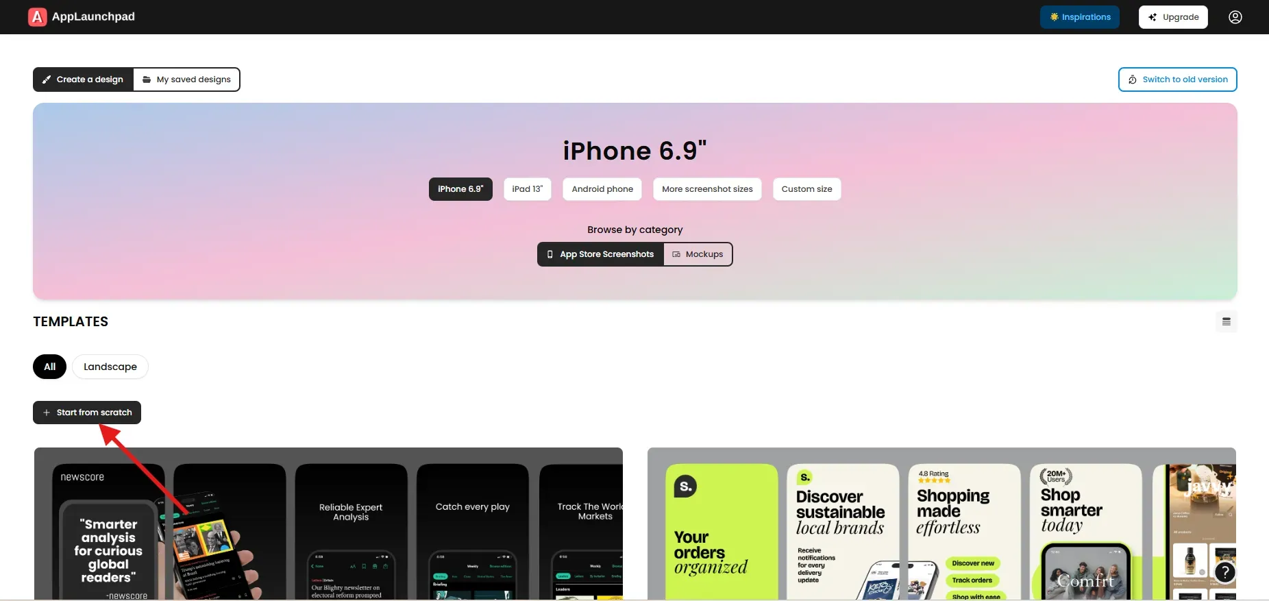
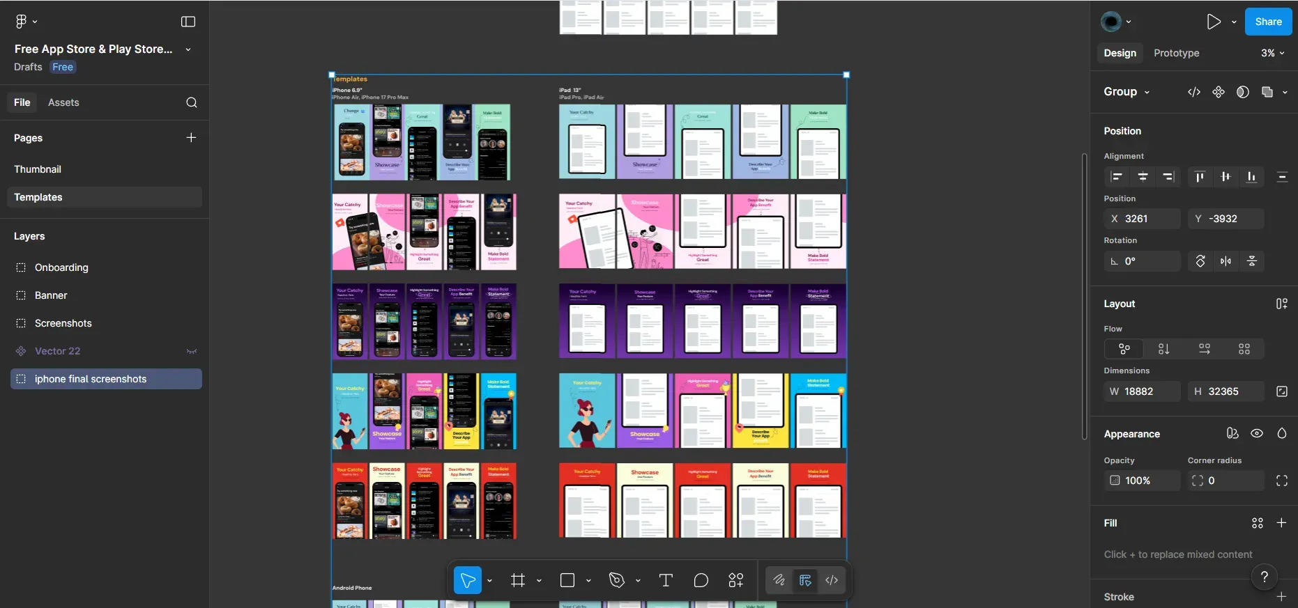
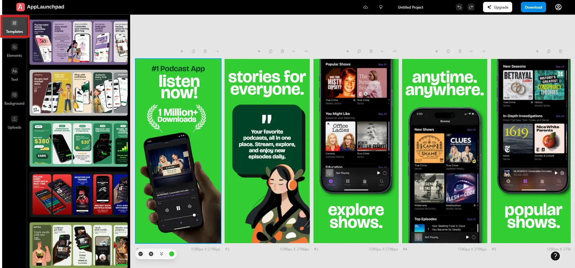
Once you are in the dashboard, choose how you want to create App Store screenshots. You can start from scratch by clicking on the Start from scratch button or use pre-designed templates. Starting from scratch gives complete freedom, but templates are faster and safer for most users.
In this guide, we use pre-designed templates because they already follow proven App Store screenshot design patterns and respect safe areas.
Select Device Type and Screenshot Size
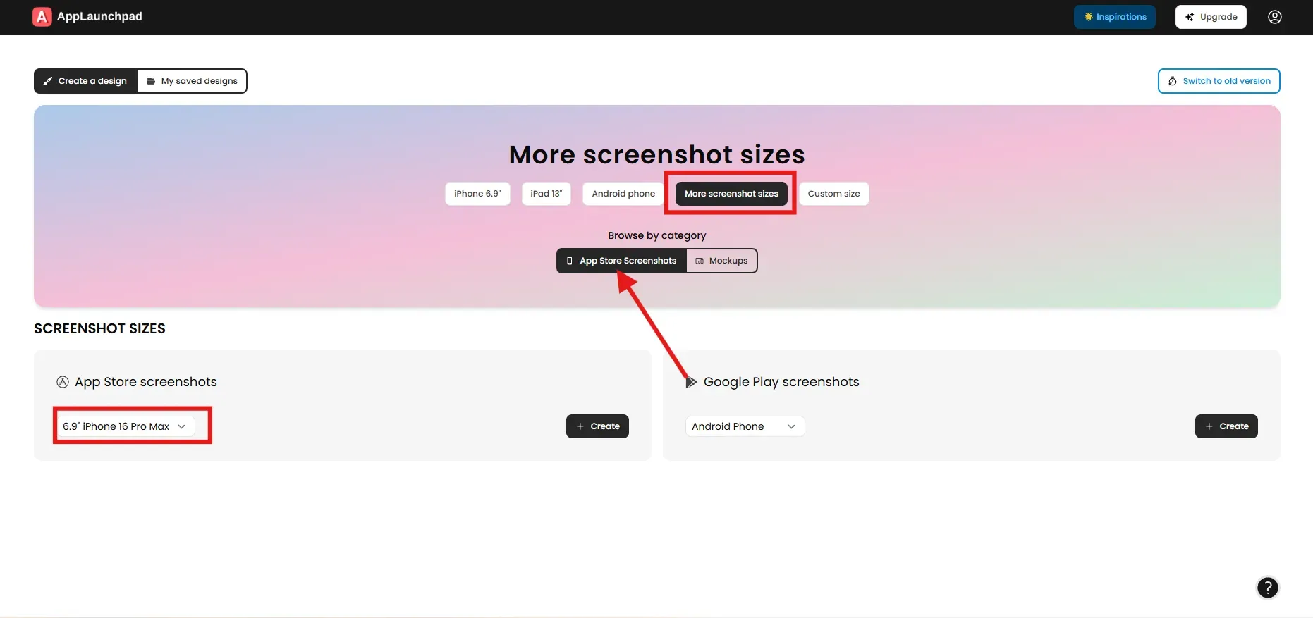
After choosing a template, select an iPhone device. By default, AppLaunchpad shows iPhone 6.9, which matches the latest iPhone models. If you want a different device, click More screenshot sizes and select the model you need.
You can also access newer iPhone and iPad models from the Elements tab inside the editor. Choosing the correct size early ensures your App Store screenshots stay compliant.
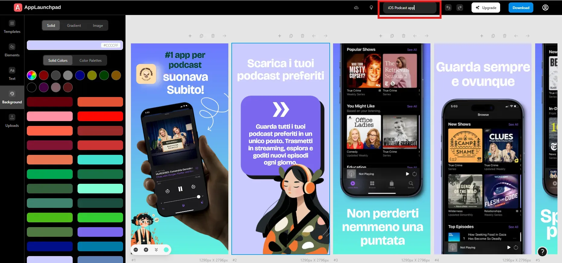
Upload App UI Screens
Once the template opens in the editor, click on the device frame. Upload your app’s UI screenshots from your system using the upload button. After uploading, select the exact device frame where each screen should appear.
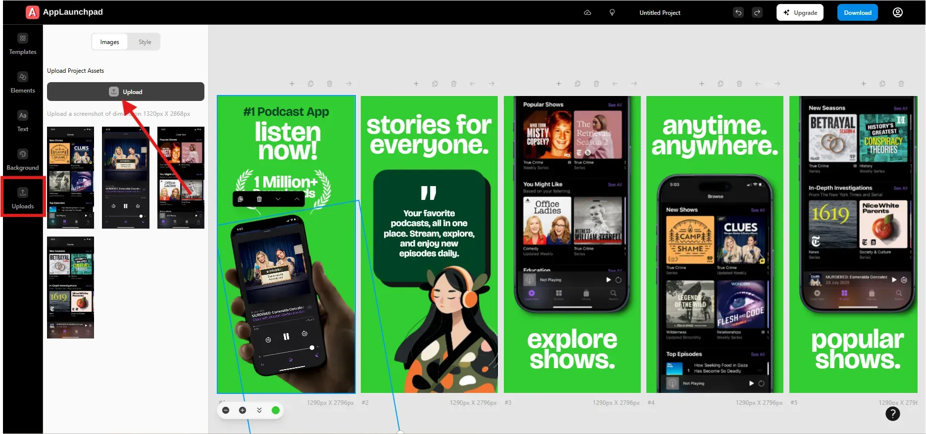
Repeat this process for every screenshot in the template. This step accurately maps your real app UI to the visual layout.
Edit Text and Captions
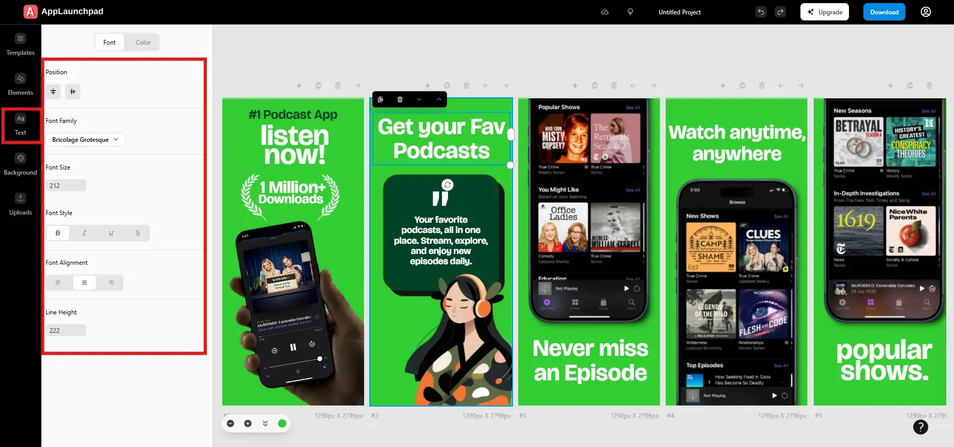
Click on any text element to replace placeholder copy with your own captions. Delete any text you don’t need. Focus on short, benefit-driven lines that quickly explain value.
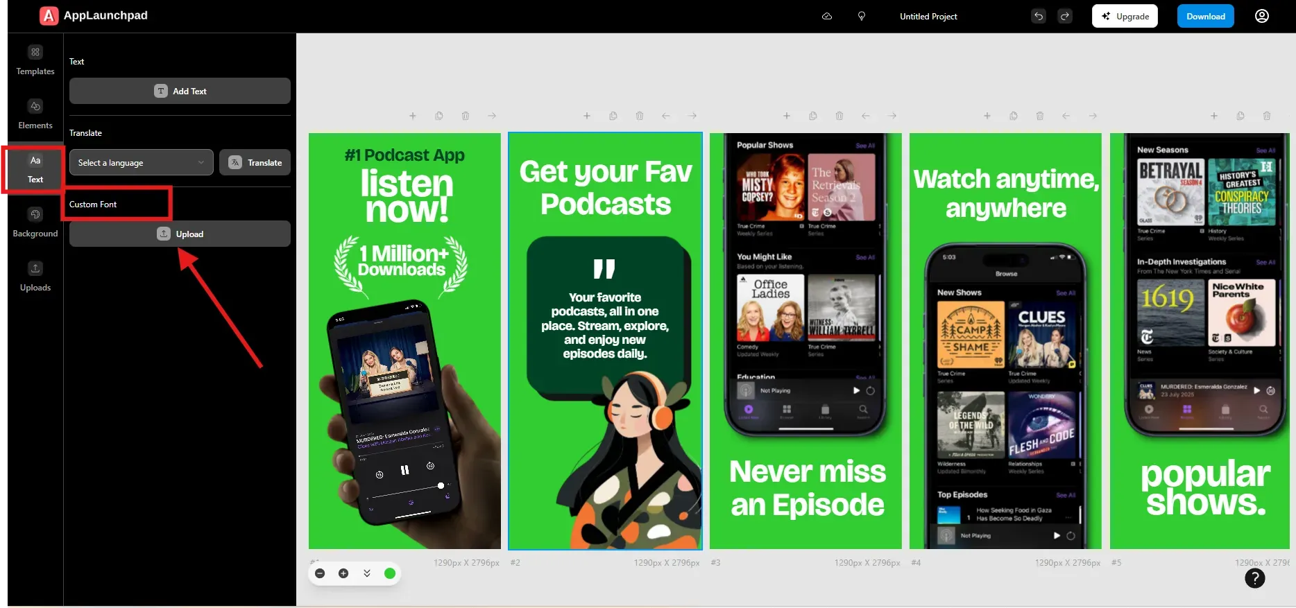
You can adjust font family, size, alignment, and color. AppLaunchpad also supports custom fonts, which you can upload from the Text tab.
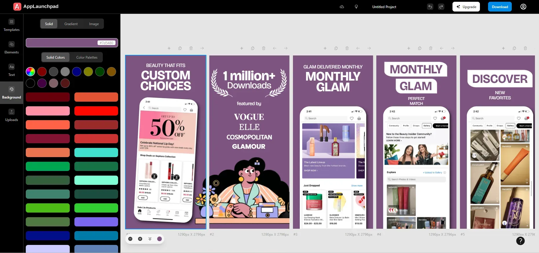
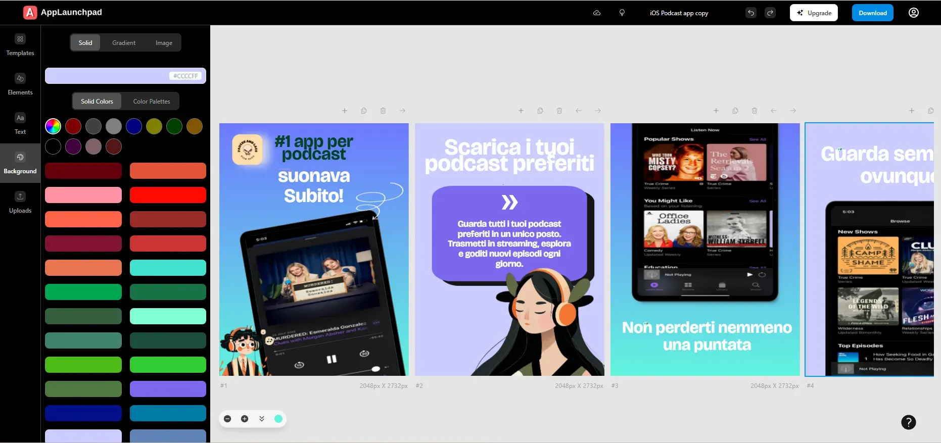
Customize Screenshot Backgrounds
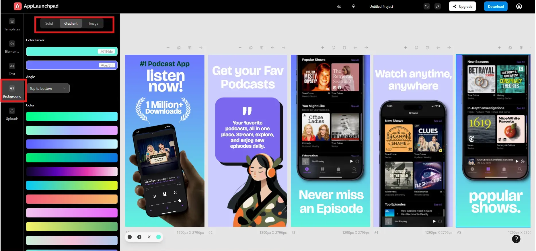
Each screenshot background can be customized. You can use solid colors, gradients, or images. For images, you can search stock visuals or upload your own.
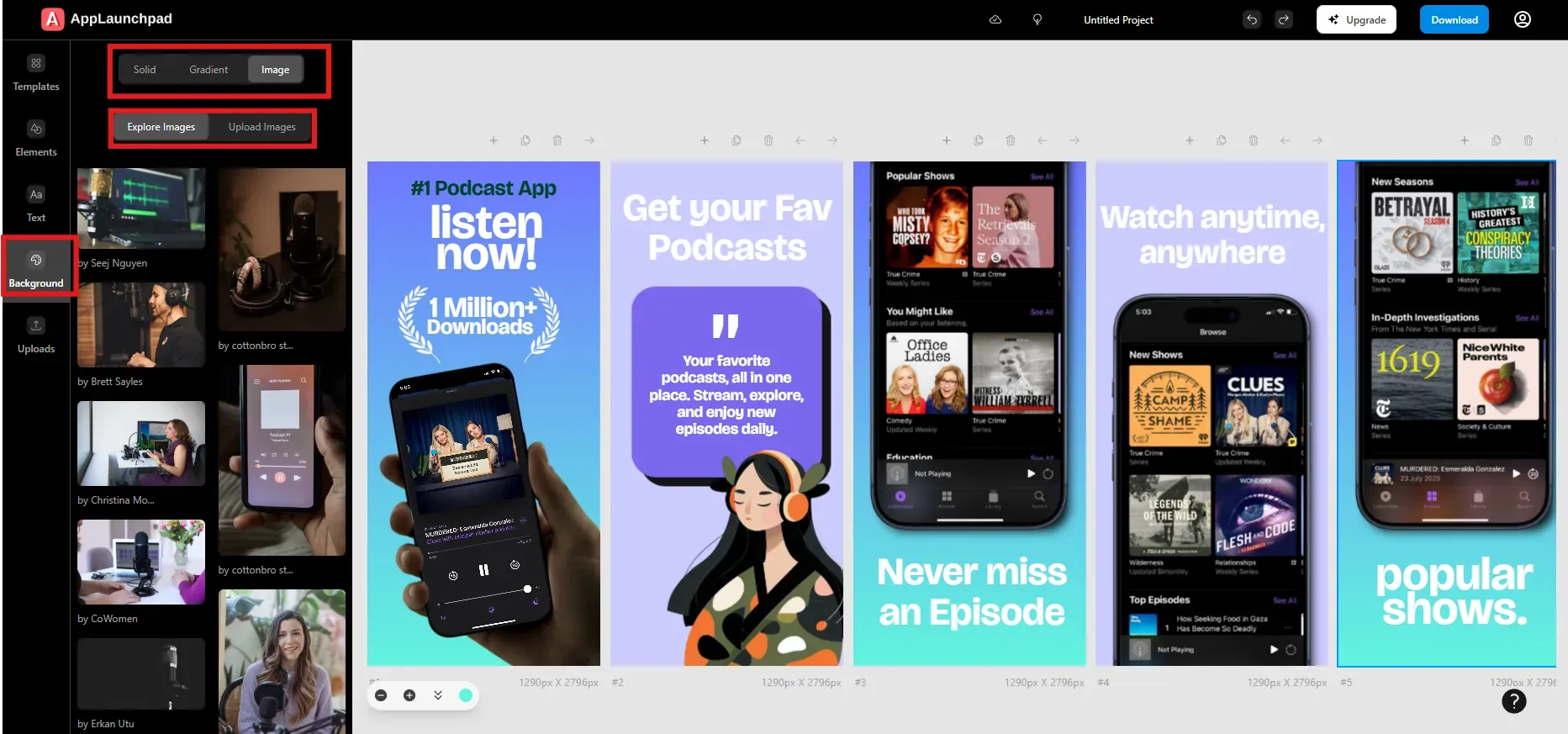
Choose backgrounds that support readability. Avoid busy visuals that compete with the app UI. High contrast improves clarity.
Add Design Elements
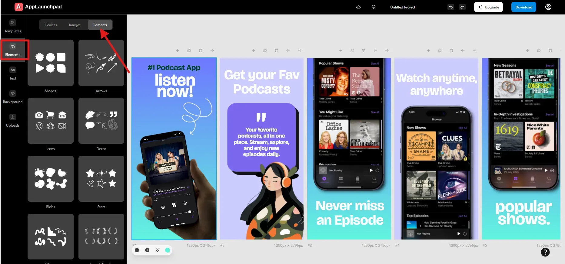
Templates may include design elements you don’t need. Delete anything that feels unnecessary. You can also add arrows, icons, shapes, or stickers to highlight key areas of the UI.
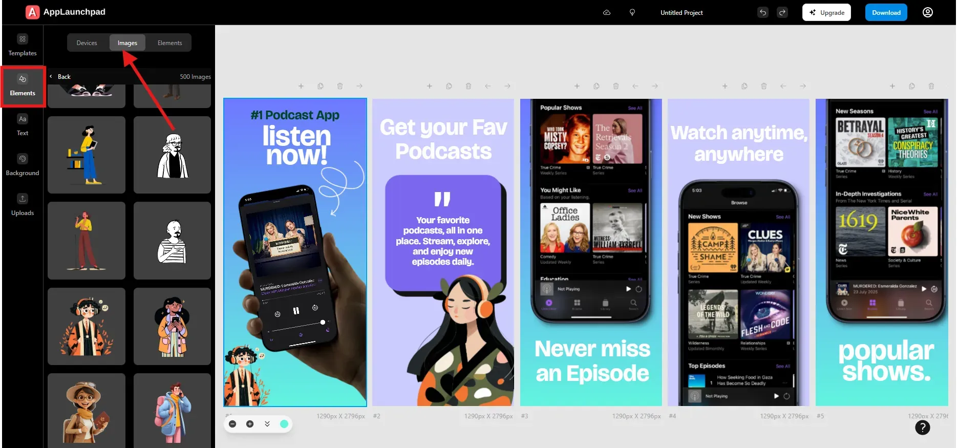
AppLaunchpad includes device frames, badges, gesture icons, and illustrations under the Elements tab. Use them carefully to guide attention without cluttering the screenshot.
Add Brand Assets
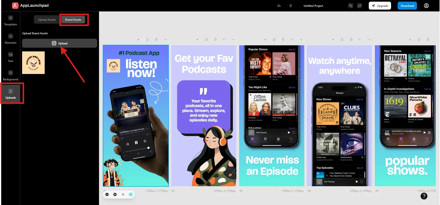
After completing the main layout, add your brand logo. Upload it from the Upload section and place it naturally within the design.
You can adjust size, add shadows, apply borders, or flip the logo. Branding should support the App Store screenshots, not distract from them.
Use AI-powered Localization (Follow if required)
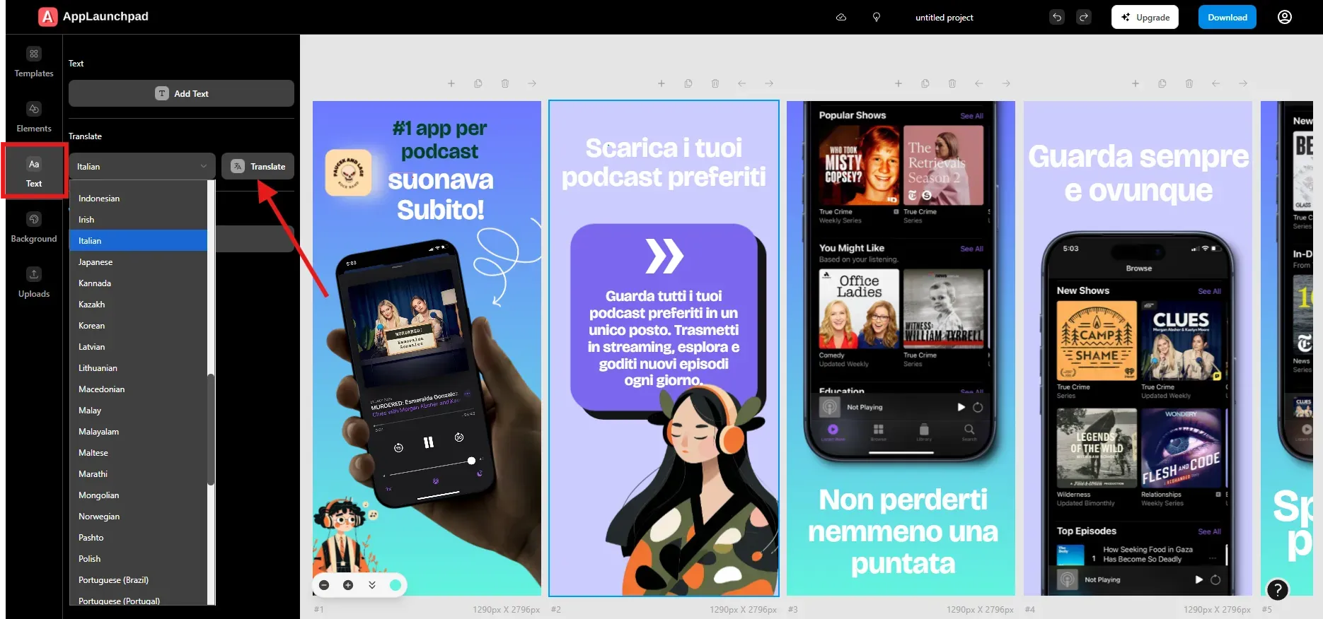
Localization helps reach users in different regions. AppLaunchpad can translate all text in screenshots into another language with one click using the Translate option. Follow this 3-step process:
Click on the Text tab on the left menu.
Look for the Translate section and select a language from the dropdown menu.
Click the Translate button on the right.
Use Smart Cloning (Follow if required)
Smart cloning is helpful if your app supports both iPhone and iPad. You can clone an iPhone screenshot project into an iPad version without recreating everything.
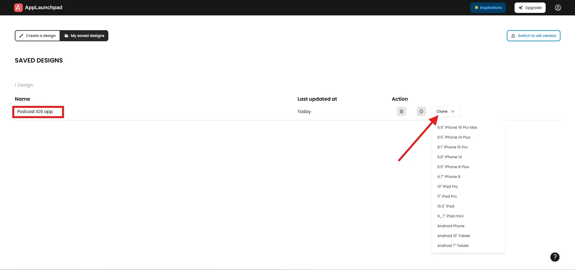
For cloning, all you have to do is go to your previous project, select the project you want to clone, and click the Clone dropdown button. A dropdown will appear; choose an iPad device. After cloning is done, you will see a copy of the original project has been added to your saved projects.
Save and Manage Your Project
Before leaving the editor, give your project a clear and descriptive name. This helps when returning later for updates.
All saved designs appear in the “My Saved Designs” section on the dashboard.
Exporting and Uploading Screenshots to App Stores
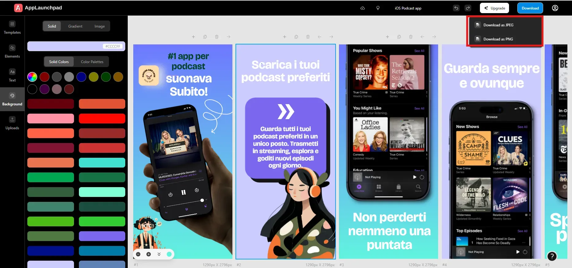
When your App Store screenshots are ready, click the Download button. Choose PNG or JPG format. PNG usually preserves UI details better and keeps text sharp.
Screenshots download as a ZIP file to your system. Upload them to App Store Connect under the correct device categories. Before submitting, preview the listing carefully to confirm alignment, cropping, and readability.
Explore Screenshot Inspiration Gallery
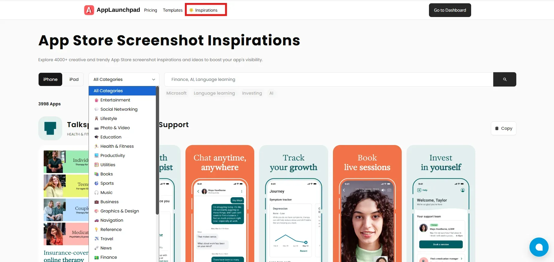
AppLaunchpad includes an inspiration gallery of screenshots from top apps. You can filter by app category and study how others structure their App Store screenshots.
This is helpful when you need ideas for layout, copy, or visual balance.
Key App Store Screenshot Requirements and Guidelines
Apple enforces strict App Store screenshot requirements. Following them prevents rejection and display issues.
| Screenshot Type | Device Model | No. of Screenshots | Dimensions | Orientation | File Format |
|---|---|---|---|---|---|
| iPhone | 6.5” / 6.9.” | Up to 10 | 1242 × 2688 | Portrait or Landscape | JPEG / PNG |
| iPhone | 5.5” | Up to 10 | 1242 × 2208 | Portrait or Landscape | JPEG / PNG |
| iPad | 12.9” | Up to 10 | 2048 × 2732 | Portrait or Landscape | JPEG / PNG |
Screenshots must use the RGB color space. Apple does not allow transparency or promotional texts.
App Store Screenshot Best Practices every Developer should Know
Good App Store screenshots follow patterns that help users understand your app quickly and feel confident installing it. These best practices will help you later in the App review process.
Lead with your strongest feature: Most users only view the first two or three screenshots. Place your core value there. For example, if your app automates expense tracking, show that feature first instead of a settings screen.
Use benefit-driven captions: Avoid mentioning features alone. Explain what users gain. For example Track expenses automatically is clearer than the expense tracker screen.
Show real app UI clearly: Always use actual in-app screens. Users want to know what the app really looks like. Real UI builds trust and makes your app look genuine.
Keep text readable on small screens: Many users browse on smaller iPhones. Use large fonts, strong contrast, and short sentences so text is legible at a glance.
Maintain visual consistency: Use similar colors, spacing, and text styles across all App Store screenshots. Consistency makes the app feel professional and well-designed.
Localize screenshots when possible: Translating text into local languages helps users feel understood and can improve conversion rates. You only need to localize your app if it's global.
Common App Store Screenshot Mistakes to Avoid
Even strong apps lose installs because of avoidable screenshot mistakes. Understanding these mistakes helps you spot problems early and fix them before they affect app conversions
Overloading screenshots with text: One of the most common mistakes is trying to explain everything in a single screenshot. If a screenshot takes more than a few seconds to understand, most users will swipe past it.
Using generic or misleading stock images: Photos that don’t reflect the app's real experience can feel disconnected and untrustworthy. App Store screenshots should always use real UI screens.
Poor contrast and unreadable fonts: Light text on light backgrounds, thin fonts, or tiny text make screenshots hard to read, especially on smaller iPhones. Always test screenshots on smaller devices before uploading.
Not using all available screenshot slots: Apple allows up to 10 App Store screenshots, but many apps use only a few. This wastes valuable space to explain features, show use cases, or address user concerns.
Not aligning screenshots with user intent: Some apps focus too much on secondary features and forget why users are searching in the first place. If users come looking for a solution to a specific problem, your screenshots should reflect that immediately.
Not clearly showcasing the real app UI: Overusing illustrations, visuals, or graphics can hide how the app actually works. If screenshots don’t show real UI, users may assume the app is unfinished or misleading.
Inconsistent styles across screenshots: Mixing different colors, fonts, or layout styles across screenshots makes the app feel unpolished. All App Store screenshots should look like they belong to the same product.
Avoiding these mistakes doesn’t require advanced design skills. It mainly requires thinking from the user’s perspective and reviewing screenshots with fresh eyes before publishing.
Conclusion
App Store screenshots play a significant role in how users judge your app before installing it. Even a well-built product can struggle if App Store screenshots are unclear or outdated. Choosing the right way to create App Store screenshots is just as crucial as building features.
When to use which approach
You just want to ship fast and meet the basic App Store requirements: choose plain screenshots.
You need high creative freedom and full control, and you don’t mind if it takes longer than it should: Choose Figma or Photoshop.
You want premium, custom-designed App Store screenshots and have the budget for it: Choose a professional designer.
You want conversion-focused App Store screenshots that are easy to update, consistent across devices, and aligned with App Store guidelines: Choose an App Store screenshot generator like AppLaunchpad.
While many approaches exist, an App Store screenshot generator offers the best balance for most teams. Tools like AppLaunchpad help teams meet App Store screenshot requirements, follow App Store screenshot best practices, and keep App Store screenshots aligned as the app evolves.
FAQs
1. What Are the Size Requirements for App Store Screenshots?
Apple defines App Store screenshot requirements by device type. Common iPhone sizes include 1242 × 2688 pixels, while iPad screenshots often use 2048 × 2732 pixels. Screenshots must be uploaded under the correct device category in App Store Connect to avoid rejection or cropping issues.
2. What Are the Ideal File Formats for App Screenshots?
Apple accepts JPEG and PNG formats. PNG is usually better for sharp UI elements and clear text. All App Store screenshots must use the RGB color space, and transparency is not allowed.
3. How Can I A/B Test My App Screenshots?
You can use App Store custom product pages to test different screenshot variations. Another approach is to update screenshots periodically and monitor install rates. Feedback from users on communities like Reddit can also encourage improvements.
4. Design Software vs. App Store Screenshot Generators: Which One Is Better?
Design software works well when you have design skills and time. App Store screenshot generators are faster and easier to maintain. For most startups and indie developers, generators provide a better balance of speed and quality.
5. How Often Should I Update My App Store Screenshots?
You should update App Store screenshots whenever major features change or when install rates drop. Regular updates keep your listing aligned with the current app experience and user expectations.
Related Blog