App Store Screenshot Guidelines In 2026
Your app screenshots are the first thing a user sees…
Published Oct 18, 2024
15 min
iOS app icon guidelines are Apple’s official rules that define how your app icon should be designed, sized, and formatted for the App Store. These guidelines cover dimensions, resolution, visual clarity, and compliance standards required for approval and consistent display across Apple devices.
Your app icon is the first thing users notice, and following the iOS app icon guidelines is no longer optional. Apple has become stricter with approvals, and even small mistakes in your icon can lead to rejection or lower conversion rates.
To make this easier, we’ve put together a clear breakdown of the exact iOS app icon size guidelines, covering ideal icon size requirements, impact, best practices, and common mistakes that lead to rejection.
We’ve also covered tools to create app icons, including AppLaunchpad, Canva, Adobe Express, App Icon Maker, and MakeAppIcon It, so you can easily create icons that match Apple’s requirements.
An iOS app icon is your app’s first visual impression and a crucial system UI element, serving as the primary button to your app. Unlike screenshots or promotional graphics that explain features, the icon represents your brand identity on its own.
To meet both design and approval standards, your icon must follow iOS app icon guidelines along with Apple’s technical requirements
In 2026, Apple will enforce iOS app icon requirements more strictly, making compliance a must. Learn about the official Apple guidelines and what to expect in 2026.
Your iOS app icon serves as a primary gatekeeper during the App Store submission process and is subject to both automated validation and manual review. Automated checks instantly flag technical failures, such as incorrect sizes or missing assets, while human reviewers rigorously inspect visual compliance with iOS app icon requirements.
Apple reviewers also check compliance with Apple App Store icon guidelines during manual review. Check out the most common reasons for rejection on the App Store.
Your iOS app icon is the single most deciding factor in your search result click-through rate (CTR). When users scan a list of apps, they decide in a few seconds whether to explore your app based almost entirely on your app icon.
Based on Apple App Store icon guidelines and ASO benchmarks, here’s what really matters. These insights align closely with modern app icon guidelines focused on clarity and recognition.
Even if your keywords and ratings remain unchanged, an optimized iOS app icon can significantly increase conversion rates.
Apple enforces a single-source-of-truth approach, requiring everything to be on a1024×1024-pixel master icon. This high resolution is critical because Apple often scales it down for various other use cases. While the App Store requires the 1024px master icon, each platform, iOS, iPadOS, macOS, tvOS, watchOS, and visionOS, has specific iOS app icon requirements that you must enforce separately.
These requirements are a core part of iOS App Store icon guidelines, ensuring consistency across all Apple devices.
For iPhone, the iOS app icon must be provided at 2x and 3x scales to support Retina and Super Retina displays.
Each resolution listed here is defined under official iOS App Store icon guidelines.
| Platform | Layout Shape | Icon Shape After System Masking | Resolution | Style |
| iPhone, iPadOS, macOS | Square | Rounded rectangle (square) | 1024 x 1024 px | Layered |
| tvOS | Rectangle (landscape) | Rounded rectangle (rectangular) | 800 × 480 px | Layered (Parallax) |
| visionOS | Square | Circular | 1024 × 1024 px | Layered (3D) |
| watchOS | Square | Circular | 1088 × 1088 px | Layered |
General app icon guidelines focus on branding, clarity, and conversion. They help your icon stand out from the crowd. Apple’s Human Interface Guidelines (HIG), however, are not suggestions. They are compliance standards. These rules determine whether your app is accepted or rejected during App Store review.
Following these iOS app icon size guidelines ensures your icon displays correctly across all screen densities.
Apple’s Human Interface Guidelines (HIG) are the non-negotiable rules for acceptance at App Store. According to the latest iOS app icon guidelines, you must adhere to the following standards
At Apple’s annual Worldwide Developers Conference (WWDC), the company sets the technological agenda for the year ahead. While Apple did not introduce new icon pixel dimensions this year, the enforcement of iOS app icon requirements has tightened significantly.
These updates reinforce stricter iOS app icon guidelines and better visual consistency across the ecosystem.
In 2026, we see greater importance placed on visual consistency. Your iOS app icon now plays a larger role in system-wide search and suggestions, so clarity at small sizes is crucial.
Key areas of high importance include
Creating every single icon manually will give you sleepy eyes, nothing more. Furthermore, Manual resizing can significantly increase the risk of pixelation errors, missing file names, or incorrect resolutions, any of which can trigger an instant rejection based on strict iOS app icon requirements.
To avoid these issues, consider using an app icon generator. For this blog, we categorized tools in 2 types: Design-first tools and Compliance-first tools. These tools help ensure compliance with both iOS app icon size guidelines and Apple App Store icon guidelines.
Choosing automation over manual workflows is a smart move as it’s faster and more compliant.
AppLaunchpad stands out as a dedicated compliance-first tool that automatically generates every required iOS app icon size from a single master file. AppLaunchpad strictly adheres to Apple’s latest technical standards and iOS app icon requirements.
With just one click, you get all the required iOS app icons in the correct sizes. It eliminates manual errors and ensures full compliance with iOS app icon size guidelines.
Canva is an excellent starting point for beginners due to its simplicity. However, it is a design-first tool with limited validation for Apple App Store icon guidelines. While great for creating your iOS app icon, it requires you to manually check that your final exports meet the exact resolution requirements. You must manually verify outputs against iOS app icon guidelines and Apple’s technical standards.
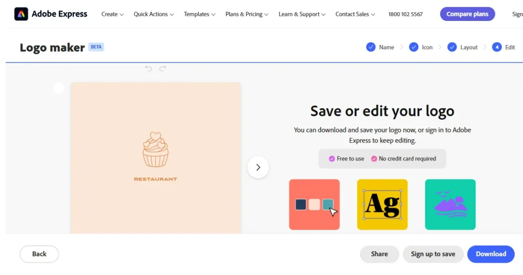
Adobe Express offers complete visual control for experienced designers who need to use vectors and layers. However, like Canva, you may need to check if the icons match complex iOS app icon requirements.
App Icon Maker is a straightforward tool for quick resizing. It takes your master image and clones it into standard sizes. However, it offers minimal guidance on current iOS app icon guidelines and requires careful manual review to ensure no icon elements are harmed during the process.
There are millions of apps on the App Store, and the bare minimum will not work anymore. It might get you approved, but it will not get you noticed. Your app icon is the face of your app, the first impression you make, and it’s everywhere from search results to home screens, competing for attention. If it does not stand out instantly, people will move on.
Your iOS app icon should instantly communicate your app’s core function. For example, the Notes app features a simple notepad as an icon. No text, no noise.
Use colors that contrast with the App Store’s white/black background. A bright, vibrant color palette often draws attention faster than muted tones.
While the icon mask is a standard rounded square, the design inside the icon can use unique shapes to break visual monotony.
Ensure your iOS app icon matches your in-app UI. If your icon is neon pink but your app is dark blue, the disconnect creates confusion, which can lead to high drop-off rates.
Always A/B test your designs using App Store Connect’s Product Page Optimization feature to see which version drives more installs.
Don’t design once and be done. Study the top apps in your niche, test your iOS app icon at the smallest visible sizes (such as the 29px Settings icon), and make changes based on performance insights.
To speed up your review process and ensure your iOS app icon is clear and conveys your app’s purpose at a glance, follow these tips from our experts. These tips are aligned with proven iOS app icon design guidelines used in high-converting apps.
Focus on one strong symbol. Multiple elements make the icon look crowded and harder to understand.
If your logo feels cramped within the square frame of icons, simplify it or use a symbol related to your app.
Use a solid or gradient color, and avoid transparency. Apple does not allow transparent icons and may reject the submission if transparent areas are detected.
Look at the top apps in your niche. Learn how they design their icons and what worked for them.
Use a border only when your icon disappears against certain backgrounds. Extra outlines can make it look heavy and highly distracting.
Do not overstyle it. Simple icons are easier to understand and easier for users to remember.
Always check your icon at the smallest size. If it is not clear at a tiny scale, users will not recognize it while scrolling, and it will lose impact.
Small changes in color or contrast can affect how noticeable your icon feels. Always A/B-test app icons before a major update, so you know which one is more likely to convert.
If your app’s growth feels like it’s going nowhere, consider giving it a fresh look. Take inspiration from Instagram’s evolution of its icon over the years.
Avoiding rejection is often about knowing exactly what not to do. The most frequent rejection triggers are actually preventable technical errors that violate basic iOS app icon requirements.
Apple App Store’s automated validation process is extremely strict. Ensure you avoid these technical mistakes:
Before you hit Submit for Review, run through this final last-minute check. A single missing asset or technical oversight can trigger a rejection, so ensure your iOS app icon is ready for the submission day. This checklist ensures compliance with all iOS app icon guidelines before submission.
Quick-Check List
Finally, do not rely solely on simulators. Test your iOS app icon on a real device to verify visibility in both Light and Dark modes. A rigorous final checkup like this ensures you meet all Apple App Store icon guidelines for a smooth, delay-free approval.
Avoid frequent changes to your iOS app icon. Update only for major features, rebranding, or seasonal events. Frequent updates can confuse users. Furthermore, make sure the new designs meet iOS app icon requirements to keep your audience engaged without breaking the familiar visual link they have with your product.
iOS app icon size guidelines define the required dimensions and resolutions for app icons across devices like iPhone, iPad, and Apple Watch. Following them ensures your app passes Apple’s automated checks.
Your App Store app icon must be 1024 × 1024 pixels. This is the master image you upload to App Store Connect. Use a PNG file, keep it fully filled with no transparency, and do not add rounded corners. Apple handles scaling and masking automatically.
Yes, you need to follow iOS app icon size guidelines for all Apple platforms. Even though you upload a single 1024×1024 icon, Apple scales it across devices like iPhone, iPad, and Apple Watch.
iOS app icon design guidelines focus on clarity, contrast, and simplicity. A well-designed icon stands out in search results and builds trust instantly. Following iOS app icon design guidelines improves recognition and increases the likelihood that users will tap your app.