ASO Checklist for App Store: A Complete Guide
App Store Optimization (ASO) is the process of improving your…
Published May 12, 2026
Learn Google Play app icon guidelines, size, format, 2026 updates, and design tips to create high-converting app icons that boost installs.
16 min
Google Play app icon guidelines define how your app icon should be designed to avoid rejection and improve installs. The Google Play Store app icon is the main visual for your Play Store listing and plays a key role in ASO by shaping first impressions and driving clicks.
To perform well, key Google Play app icon guidelines include using a simple, recognizable design, avoiding text or badges, maintaining proper padding, and ensuring clarity at small sizes. This becomes even more important with the 2026 update, which will automatically render icons with a 30% corner radius, making safe zones critical.
Along with design, you must also follow the Google Play app icon requirements, including a 512×512 px size, a 32-bit PNG format, and a file size under 1024 KB. Tools like Android Asset Studio, AppLaunchpad, and official Google Play app icon design templates help create compliant icons faster.
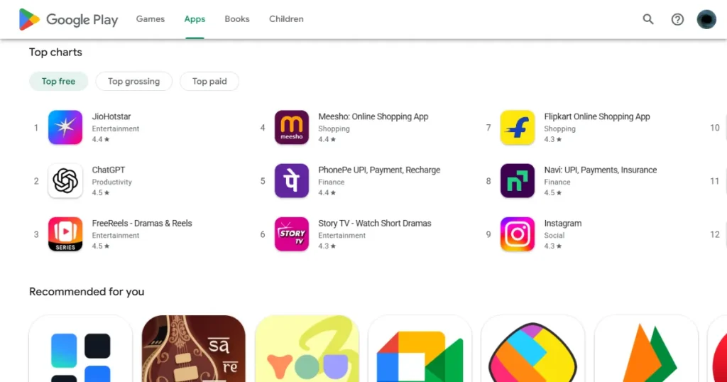
The Google Play Store app icon is the primary visual asset of your app listing page. It works as the face of your app across various search results and app categories on the Google Play Store.
App icons appear in multiple places, such as:
Unlike launcher icons on a phone, Google Play Store app icons are static images. Their main purpose is to increase app discovery, not interact with your phone’s operating system.
After you upload your app icon files, the Google Play Store automatically applies rounded corners and drop shadows. This is a default setting for all Google Play Store app icons, making the whole store look more visually consistent.
If your app icon doesn’t follow Google Play app icon guidelines, your app may face launch delays or even be rejected, forcing rework.
Below are the common Google App Icon guidelines that are a must:
When designing your app icon, you can either use a full-bleed layout that fills the entire space or position your app icon design using Google’s keyline grid. Just remember: follow the Google Play app icon guidelines and don’t apply rounded corners or drop shadows, as Google applies them automatically.
The app icon is one of the very first visual cues users rely on. Because people scroll through the Play Store so quickly, they do not always read app descriptions.
People make quick decisions when browsing the Play Store. A clear app icon helps build recognition and trust, which in turn improves app installs.
Google Play Store is actively changing how it displays app icons to make everything look cleaner. Let’s look at one of the recent updates from the Google Play app icon guidelines.
Google is standardizing app icon rendering to ensure greater visual consistency across all Play Store layouts and devices. They want every single app to share the exact same outer shape and border style.
Using a single app icon image and style helps keep the focus on the design, rather than being distracted by irregular shapes. This improves the overall visual hierarchy and readability in dense, crowded search result pages.
In this new Google app icon guidelines update, all Google Play Store app icons will automatically render with a 30% corner radius. This is slightly more rounded than the older 20% standard.
This Google Play app icon guidelines update affects only the Google Play Store display. It does not change your launcher icons or adaptive icons on the phone.
Because of this, you do not need to do any of the following:
The required app icon workflow remains completely unchanged. You just need to use a perfectly square PNG app icon.
As the Google Play Store adds rounded corners, you must be careful with your layout. You must maintain 15-18% internal padding around the key design elements.
If you ignore this padding rule, the new rounded mask will chop off your main app icon design.
To avoid this issue, you need to apply internal padding to these key elements:
Make sure to always preview your app icons at 48px and 72px sizes to ensure mobile device readability.
Getting your file format right is the very first step of uploading your Google Play Store app icon without error. Take a look at the following Google Play app icon requirements.
According to Google Play app icon requirements, your app icons must be exactly 512 × 512 pixels. If your image is off by even a single pixel, the upload console will throw an error.
Moreover, these app icons must be perfect squares without any rounded corners applied. You can choose 2 different layout styles while building an app icon:
Keyline grids ensure the entire app icon feels visually balanced.
According to the Google Play app icon requirements, your app Icons must be uploaded as 32-bit PNG images. Standard JPEGs or GIFs will not work for this specific requirement.
Your exported files must also meet a few other color rules:
Note: sRGB is the standard color format used by most screens, browsers, and Android devices. It defines how colors are displayed, so your icon looks the same across different phones.
Using the sRGB color profile ensures your brand colors look consistent across millions of different Android devices.
Google Play app icon requirements have a strict Google Play app icon size limit of 1024 KB. If your app icon is larger than this, you cannot use it.
If your Google Play Store app icons exceed the maximum size limit, compress your PNG images carefully to maintain quality without blurring. You can use the tools below for that.
It’s incredibly common for beginners to get confused here because the names sound almost the same, launcher icons and Google Play Store icons. At a glance, they feel like the same thing, but they actually serve completely different purposes.
Launcher icons appear directly on an Android device’s home screen and inside the app drawer. These are the icons users tap to open your app.
Google Play Store icons, on the other hand, are only used inside the Play Store. They show up in search results, listings, and recommendation sections when users are deciding whether to download your app.
The technical difference is important too:
So while the names sound similar, they belong to two different systems. One for device UI, the other for app discovery.
To understand the difference, you need to know how phone icons actually work.
Adaptive icons were first introduced in Android 8.0 to clean up the messy home screens. Instead of a flat picture, these app icons consist of two separate layers put together.
There is a foreground layer that holds your logo or main app icon design, and a background layer that holds your brand color. Because Android launcher icons use two layers(foreground and background), the system can apply different shapes to them.
A phone might display layers as circles, squircles, or rounded rectangles, depending on the device model. This system ensures app icons remain visually consistent across all the different apps on an Android device.
When you build these layered Adaptive icons, keep your foreground icon elements perfectly centered. You want to avoid placing any important design element near the edges. If they sit too close, the Google Play Store’s shape mask might cut them off.
Follow these simple best practices for your adaptive designs:
So far, we’ve covered the Google Play app icon guidelines and technical Google Play app icon requirements, but meeting those rules alone isn’t enough. You can upload a perfectly valid icon and still get ignored, because what really matters is how it looks to the users. Strong design is what makes people notice your app and tap install.
Focus your design on one primary visual element that explains what the app does. Avoid clutter or excessive background graphics that confuse the user.
Check out WhatsApp for a great example of this. They use a simple speech bubble with a phone symbol to instantly communicate messaging.
Spotify does the same thing with a minimal green circle and sound waves, representing a mic.
High color contrast significantly improves your app icon’s visibility and makes it stand out in crowded search results.
Netflix is a perfect real example of this, using a bold red N on a dark black background.
Google Maps also uses a bright, colorful pin symbol that is impossible to miss.
Text becomes a blurry, unreadable mess when icons scale down to small mobile screen sizes. People will not squint to read a paragraph inside a tiny box.
For example, Instagram relies solely on a recognizable camera glyph rather than trying to fit text into the image. Let your app icon do the talking, and save your words for the app title or other key elements.
Your Google Play Store app icons should always reflect your brand’s overall color palette and identity. For instance, if you are designing a medical app, you need to use brand colors that are relevant and complementary.
Consistent branding builds trust, much like how YouTube maintains its exact red play button across all platforms.
You have to test your app icons on mobile phones, Android tablets, and foldables before launching. Ensure your icons remain recognizable even at 48px preview sizes, which is how they often look in search lists.
Google Play Store regularly reviews listings to make sure developers are not using cheap tricks. Breaking these rules and Google Play app icon guidelines can result in your app being hidden or banned entirely.
Avoid placing manipulative labels on your icon design. Putting text like #1 App, Top Rated, or Best App directly violates Google Play Store metadata policies.
You should never include words such as Free, Discount, or Sale in your image. All of your promotional pricing details should be written in the description.
Do not try to make your app look like it is officially endorsed by Google. You cannot include Google Play Store’s logo, developer program badges, or app category tags in your icon design.
According to the official Google Play app icon guidelines, app icons must accurately represent the app’s actual function. For example, a basic flashlight app using a complex camera icon could mislead users and get flagged for removal by the Google Play Store.
Using recognizable brand logos you do not own will result in an immediate listing rejection. Only use designs you have the legal right to publish.
Too many design elements can make app icons incredibly hard to recognize. Some early mobile games used characters, logos, and text within a single icon, severely reducing clarity.
If the main icon design is placed near the edges, it may be clipped awkwardly by the Google Play Store’s default rounded mask. Always follow the Google Play app icon guidelines for padding to keep your logo intact.
Uploading app icons below the recommended Google Play app icon size of 512px and stretching them to fit can cause blurry or pixelated store listings. Always start with a high-resolution file and export it properly.
Google Play Store app icons must remain clear even when displayed at a 48px Google Play app icon size. A highly detailed app icon might look great on your monitor, but it will look like a smudge on a small mobile device screen.
You do not need to build everything entirely from scratch. There are excellent tools available to help you create these icons perfectly.
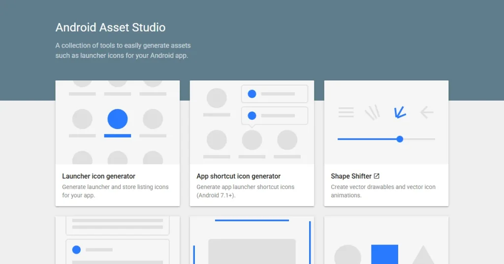
Android Asset Studio is a helpful tool that automatically generates your adaptive launcher icon layers. It lets you quickly preview your app icon across multiple Android device masks in your browser.
If you want total control over your graphics, use industry-standard tools. Popular tools include Figma, Adobe Illustrator, and Adobe Photoshop.
These design software allow creating a clean app icon design, precise grid alignment, and effortless high-resolution exporting.
Google actually provides official templates to help you create your app icons. These files include the exact keyline grids and positioning guides you need to stay safe.
You can download their official Sketch, Adobe Illustrator, or Photoshop template, depending on which software you use.
AppLaunchpad is an extremely useful tool for developers who need quick, store-ready assets. It offers an in-built App icon generator that lets you upload your master app icon file and generate all the required app icons that comply with Google Play app icon guidelines.
You do not have to guess if people like your new icon design. You can use real data to figure out what gets the most clicks.
The Google Play Developer Console lets you upload multiple app icon variations at once. You can compare install performance across different icon designs, since Google automatically splits your traffic.
While running your test, you need to monitor three core metrics. Pay close attention to your impressions, store listing visits, and your install conversion rate.
Use the ASO data to improve your app icons by adjusting the design over time. If a design fails, try adjusting the color contrast, visual focus, or brand prominence to see if things improve.
Before you hit publish, run through this quick, final checklist to avoid any possible errors.
The Google Play Store requires an exact 512 × 512-pixel square image. Upload your app icon as a 32-bit PNG, under 1024 KB, in the sRGB color space. Google Play Store automatically applies rounded corners, so do not round them yourself.
Google strongly discourages text because it becomes blurry and unreadable on small mobile screens. Promotional text like “Free” or “Best App” violates store policies and may result in your app being removed.
Use the Google Play Store Listing Experiments tool to run A/B tests. Upload multiple icon variations to see which design gets the highest install conversion rate.
Launcher icons appear directly on an Android home screen and use layered adaptive formats. Google Play Store icons are static PNG files used purely for marketing inside the store.
Keep the design incredibly simple, use high contrast colors, and avoid visual clutter. Ensure the app icon follows all Google Play app icon guidelines, remains clear at a 48px Google Play app icon size, and perfectly aligns with your branding in your marketing materials.
Google Play app icon guidelines focus on simple, clear design, no text or badges, proper padding, and strong contrast. Icons should remain recognizable at small sizes and must not include misleading elements or promotional content.
The correct Google Play app icon size is 512 × 512 pixels. It must be a perfect-square image, as Google automatically applies rounded corners; do not design the icon with rounded edges.
Google Play app icon requirements include a 512 × 512 px image, 32-bit PNG format with transparency, and a file size under 1024 KB. The icon should be high-quality and follow Google’s design and content guidelines.