AppLaunchpad vs Placeit: Detailed Comparison
AppLaunchpad vs Placeit comparison for app screenshots. Learn which tool…
Published Jun 23, 2026
Learn how to optimize App Store screenshots to boost installs and conversions, with clear guidelines and high-converting design practices.
17 min
App Store screenshots optimization is a part of ASO, it deals with designing app screenshots to improve conversion rates and drive more installs. It relies on showing real app UI, highlighting key user benefits up front, optimizing the first 2-3 screenshots, and maintaining strong readability and visual consistency throughout.
Following App Store screenshots guidelines is just as important to avoid launch delays and prevent any possible app rejection. Using the AppLaunchpad app store screenshot generator makes this easier with ready-made templates, localization, and quick edits. Tools like Canva, Placeit, or Figma can also help, depending on your workflow.
The process doesn’t end here, you must also A/B test screenshots using tools like Storemaven, SplitMetrics Optimize, or native tools like Google Play Console.
App Store screenshots are images that showcase your app on its listing page. They quickly highlight your app’s look, features, and main benefits in an easy-to-understand way. These visuals are the foundation of effective App Store screenshots optimization.
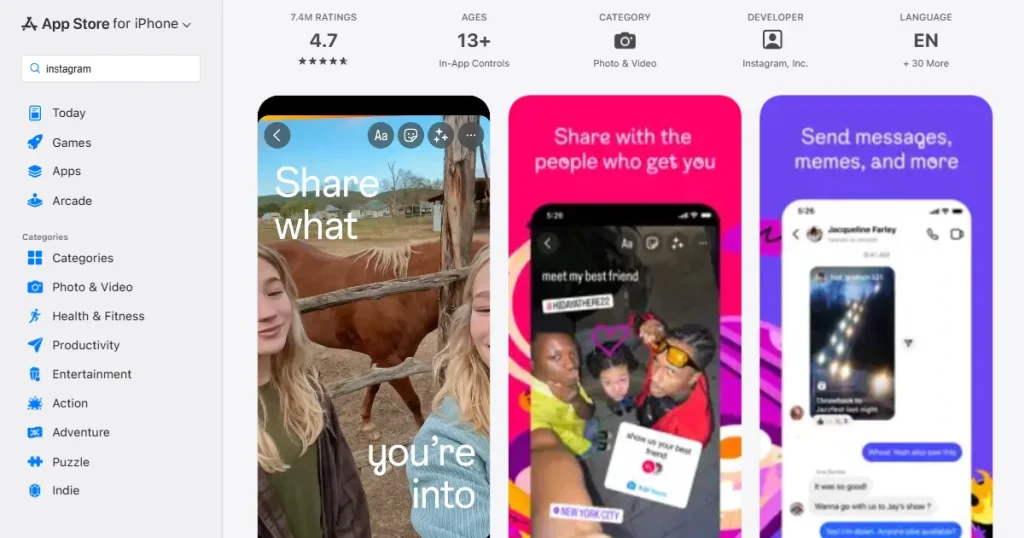
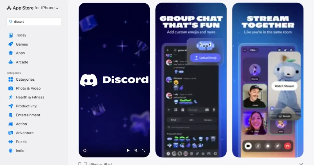
These images usually mix real app screens, short captions, and your branding assets. They serve as your visual pitch, since most users decide to download without reading the full description.
Screenshots need to show value right away, unlike videos. Each screenshot should connect logically to the next, guiding users through your app step by step.
Keywords bring users to your app page, but it’s your screenshots that convince them to download the app. Here are the main reasons why they matter so much.
Pro Tip: Well-designed screenshots are central to App Store screenshots optimization and can help you get more downloads than competitors who rank higher but have weaker visuals.
Before we go deeper into App Store screenshots optimization strategies, let’s take a quick look at App Store screenshot guidelines for App Store and Google Play Store.
| Feature | Apple App Store screenshot guidelines | Google Play Store screenshot guidelines |
| Screenshot Limit | Up to 10 per device type (iPhone, iPad) | Up to 8 total |
| Resolutions | Requires multiple specific resolutions for different devices | Only one set is required for simplicity |
| Search Visibility | First 3 screenshots appear directly in search results | The feature graphic plays a major role alongside screenshots |
| Design Style | Text overlays are highly common and expected | More flexible with less dependency on heavy text |
| Formatting | Supports both portrait and landscape | Landscape is highly recommended for games |
| Spacing | Requires safe area spacing to avoid native UI cropping | Generally more lenient on edge-to-edge design |
| File Format | PNG and JPEG supported (high-quality images recommended) | PNG and JPEG supported (PNG preferred for better clarity) |
| Screenshot Aspect Ratio | iPhone: 19.5:9 (modern devices), iPad: 4:3 | Flexible, but typically 16:9 (landscape) or 9:16 (portrait) |
To improve conversions and drive more installs, your screenshots need to follow proven design and messaging principles, here are 25 strategies that consistently work.
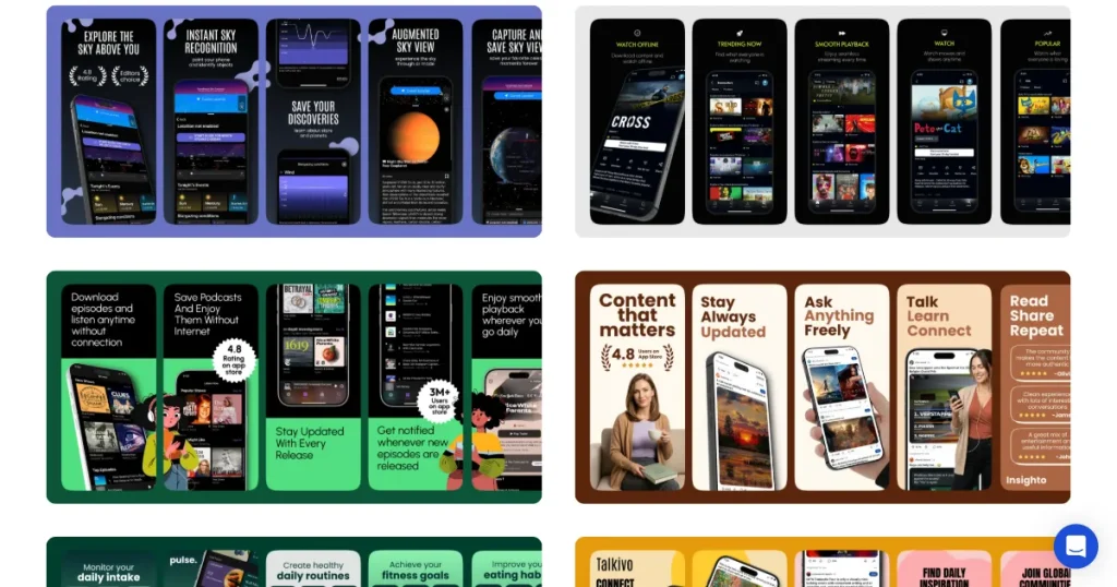
Show real App UI for better App Store Screenshots Optimization. Use real, accurate screenshots from your app. Avoid fake or overly edited images that don’t match the actual app UI. Showing the real interface helps set clear expectations, builds trust, and reduces early uninstalls from users who feel misled.
Focus your text captions on the value your app offers to the users, not just its technical features. For example, use ‘Save 5 Hours Weekly’ instead of just ‘Task Manager.’ This helps users quickly see how your app solves their problem and adds value. This is one of the most effective App Store screenshots optimization techniques.
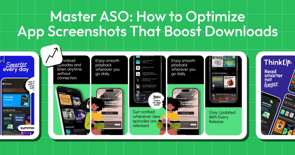
Most users only look at your first one to three screenshots before deciding. This structure is essential for App Store screenshots optimization because most users don’t scroll further. Make sure these first images clearly show your main value and strongest selling points. Treat them as your most important tools for convincing users to download your app.
Readability is a core pillar of App Store screenshots optimization. Mobile screens are small, and users scroll quickly. Use large, bold fonts and make sure your text stands out from the background. If users have to squint or zoom in to read, they’ll probably just leave your app store page.
An app preview video isn’t a screenshot, but it works well with your images. It lets you show complex features or gameplay that app screenshots can’t capture, helping users better understand and engage with your app.
When adding text overlays to your screenshots, keep the language entirely focused on user benefits. Keep the text incredibly short and scannable. People are skimming, so a punchy, benefit-driven caption is far more effective for App Store screenshots optimization than a long sentence explaining how a feature works.
Don’t just upload random screenshots. Arrange them to tell a story, start with a problem, show how your app solves it, and finish with the positive outcome. Storytelling improves App Store screenshots optimization by increasing downloads.
Make sure all your screenshots use the same colors, fonts, and layout. Don’t change styles halfway through. A consistent, professional-looking screenshot can help App Store optimization by making your brand appear trustworthy and high-quality.
Design clutter is one of the most common mistakes in App Store screenshots optimization, as it breaks the visual hierarchy. Focus on one main message and one clear image per screenshot. Avoid adding too many feature-based elements or long text. Use empty space to make your design easy to read and guide users to what’s important.
High-quality visuals are non-negotiable for App Store screenshots optimization. Export your screenshots at the exact high-resolution sizes and JPG/PNG format the app stores require. Blurry or pixelated images can make users think your app is low quality or buggy.
When designing, be hyper-aware of native device UI elements such as the iPhone Dynamic Island, the top notch, and the home indicator line at the bottom. Keep all your crucial text and UI elements within the safe zones so they aren’t accidentally overlapped or cropped.
Strictly follow the official App Store screenshots guidelines as part of your App Store screenshots optimization process. Submitting the wrong dimensions can lead to cropping issues, distorted images, or flat-out rejection during the app review process, delaying your launch.
iOS and Android app stores have different visual expectations and layout. While the core message can stay the same, tailor your device mockups and general formatting to match the specific platform you are uploading to.
If you are framing your app UI within a physical phone graphic, make sure you are using clean, modern, and up-to-date device mockups. Using an old phone frame can make your app look outdated from the start.
Use background colors strategically to guide attention and evoke the right emotions. For example, blue can build trust for finance apps, while orange or red can add excitement for games. Always maintain a strong color contrast so your app UI pops against the background.
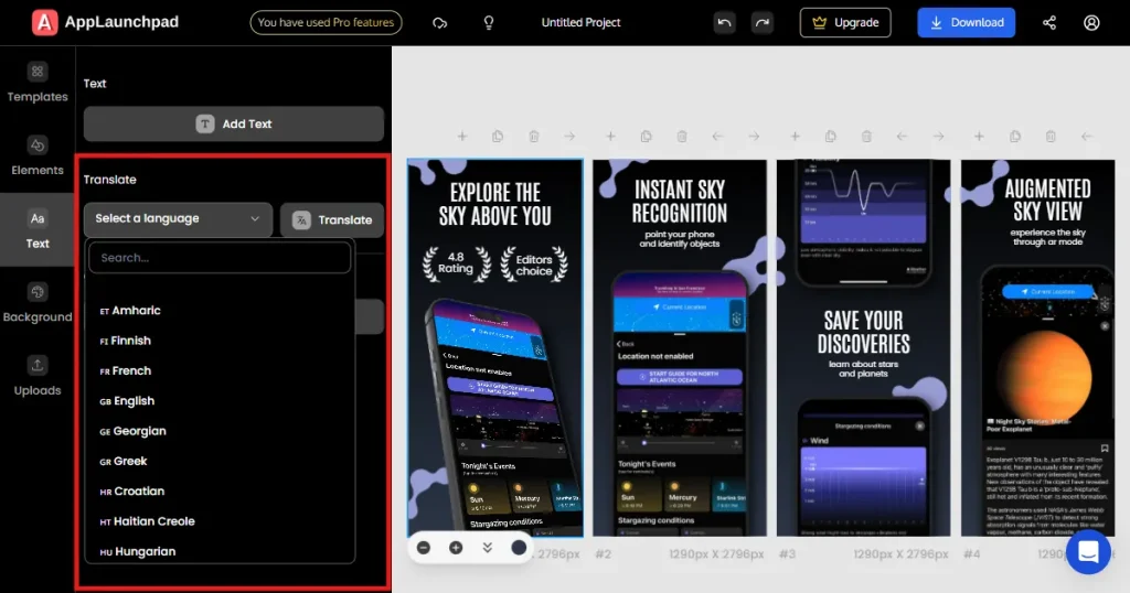
Localization is a major growth lever in App Store screenshots optimization. If your app is available globally, translate the text in your screenshots into the native languages of your target regions. Beyond just language, adapt the visuals, currency symbols, and cultural references to align with local preferences, which significantly boosts conversion rates.
If your app has dashboards or analytics, fill them with realistic data. Avoid showing empty screens. Real data helps users understand the value of your app and picture the kind of results they can achieve with it.
People trust what others trust. Add social proof to your screenshots, such as high star ratings, user reviews, or large user numbers (e.g., Trusted by 2 Million Users). Social proof strengthens App Store screenshots optimization by improving trust.
Don’t just show the app’s interface, show the results. For a fitness app, include the UI with a picture of a healthy runner. Making users relate and feel inspired leads to more downloads than just showing features.
Use all the screenshot slots the app stores allow. Even if your app is simple, use all 10 slots on the Apple App Store and all 8 slots on the Google Play Store. This lets you tell a fuller story, show more use cases, and give users more reasons to download. Using all slots improves App Store screenshots optimization by increasing visibility.
If your app serves multiple user personas, use different screenshots to address each persona. For example, highlight ease of use in the first few screens for beginners, and showcase advanced, granular tools later in the sequence for your power users.
For the vast majority of mobile games, landscape screenshots work best. Landscape orientation offers a much wider, better representation of the gameplay environment and creates a more immersive, cinematic feel that attracts players.
A panoramic sequence lets visuals or text flow from one screenshot to the next. This creates a smooth, connected look and encourages users to keep swiping through your gallery to see the rest of the image.
Keep your app listing fresh by updating visuals for big events, holidays, or seasons. Adding a holiday theme or highlighting a summer-specific feature in June shows users that the app is actively supported.
Consistently test different headlines, background colors, and screenshot orders using A/B testing tools. Making changes based on real user data is one of the best App Store screenshots optimization strategy to improve your conversion rate over time.
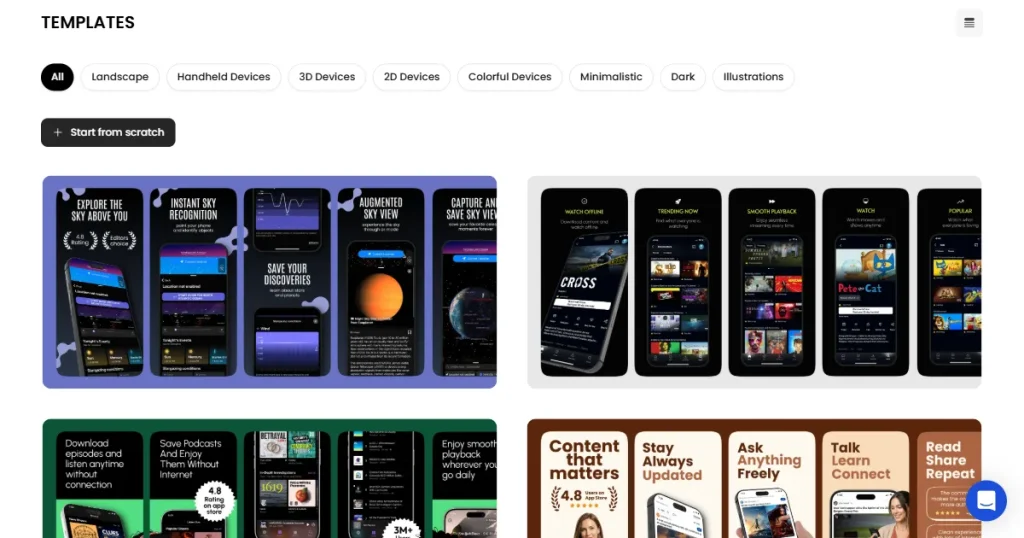
Creating app store screenshots that are App Store screenshot guidelines and Play Store guideline-compliant becomes easier with the right tools.
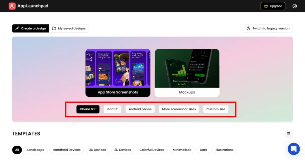
AppLaunchpad
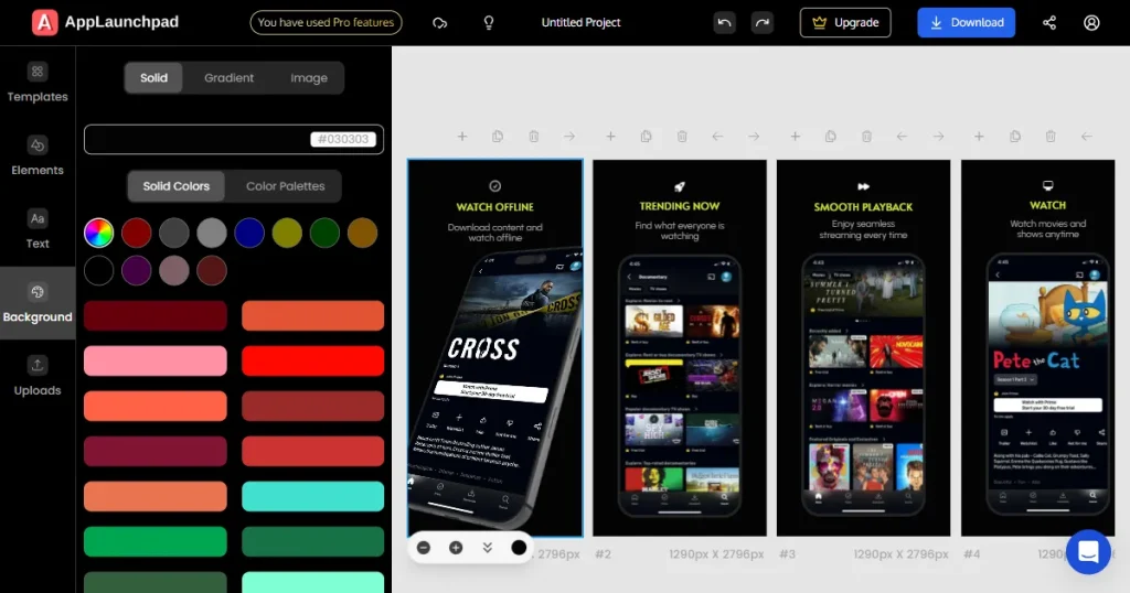
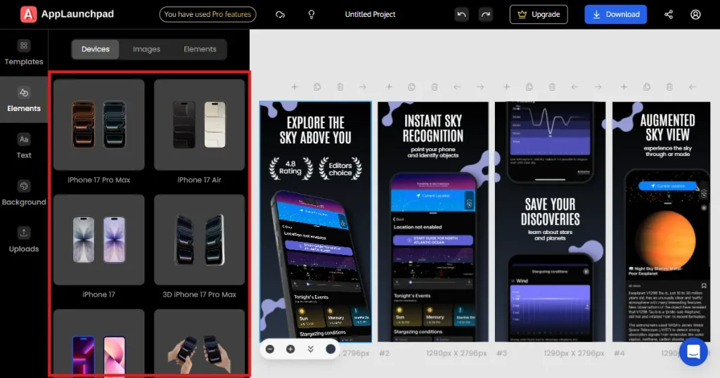
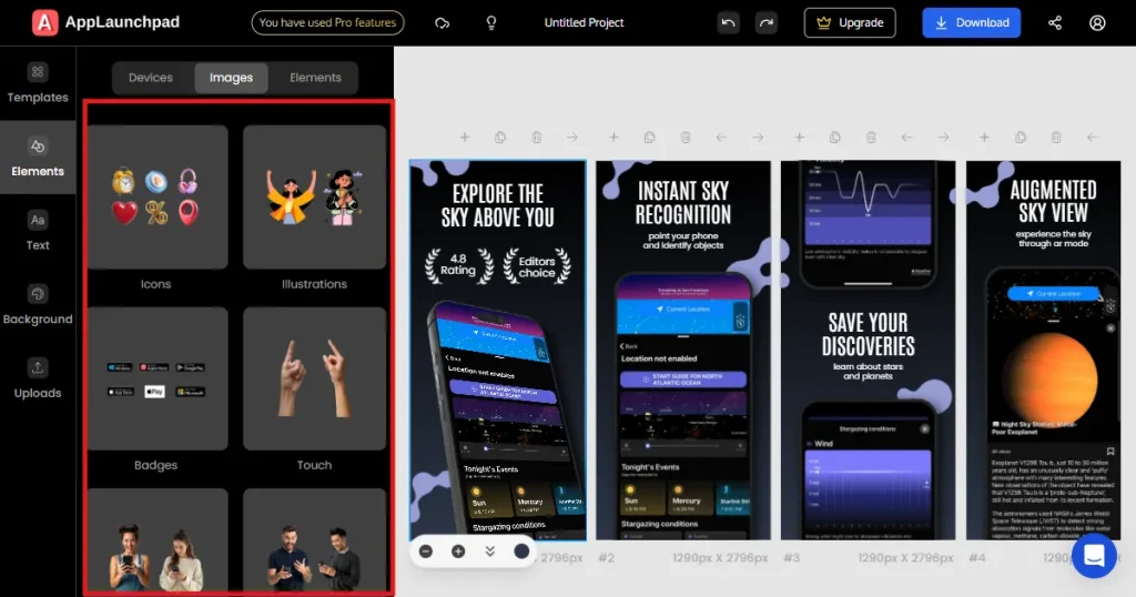
AppLaunchpad is a screenshot tool that speeds up design by removing manual work and letting you reuse screenshot templates through project cloning. It offers 1000+ ready-made templates you can adjust with your app’s UI. It also handles device framing and lets you quickly create assets for more than 80 languages, including Spanish, Japanese, Korean, and more.
Canva
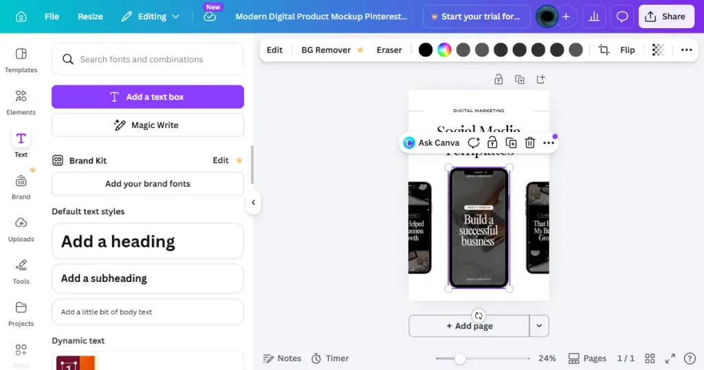
Canva is an easy-to-use online design tool, great for teams without a graphic designer. Its drag-and-drop interface and large library of stock elements make it simple to create app store images. While it doesn’t have app-store-specific features, its flexibility is helpful for quick changes.
Placeit
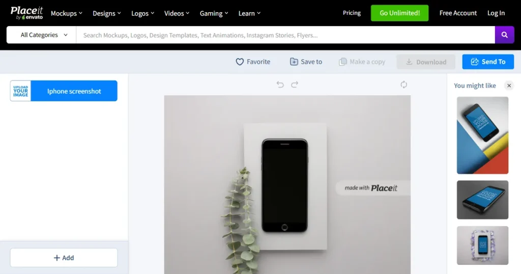
Placeit focuses on high-quality, realistic mockups. You can show your app in real-life settings, like in someone’s hand at a coffee shop or on a 3D device. Just upload your UI, and Placeit adds it to their photos, helping your screenshots feel more relatable.
Figma
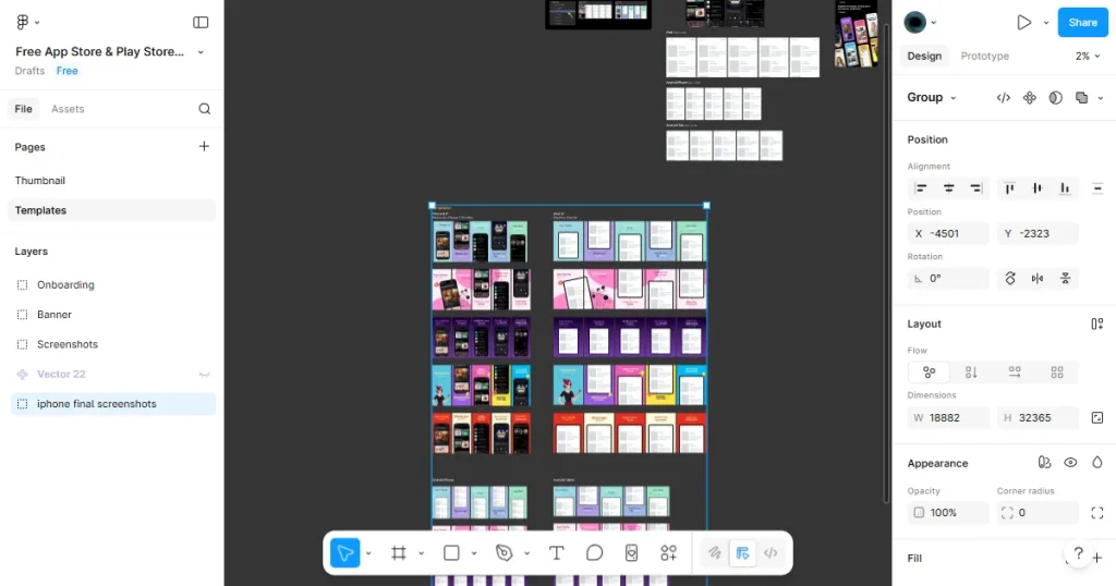
Figma is one of the top tools for professional UI and UX design. Advanced teams often use these tools as custom App Store screenshot generators. They give ASO teams full control over every detail, from pixels to fonts. Designers can create custom panoramic screenshots and manage large libraries of branded assets for global campaigns.
SplitMetrics Optimize
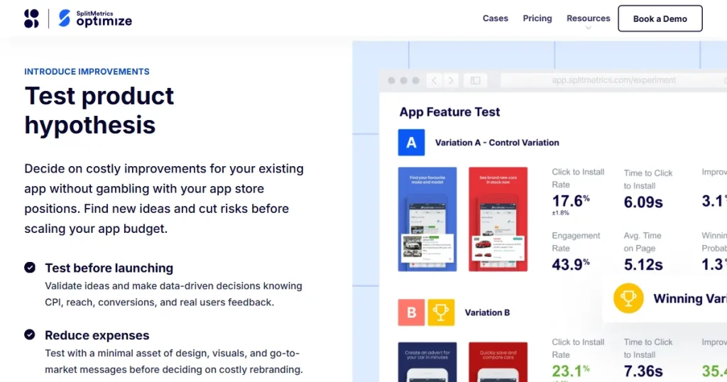
SplitMetrics Optimize is a tool made for mobile growth teams to run A/B tests on app visuals. You can test different screenshots to see which one gets more installs. Its analytics also help you understand why users prefer one version over another.
ASO.dev
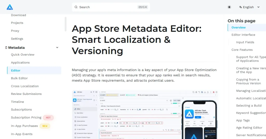
ASO.dev is a helpful tool for quickly editing metadata and optimizing. It lets developers and marketers see how their screenshots, titles, and descriptions will look in the store. Teams can adjust visuals and text in real time to make sure everything looks right before updating.
Google Play Console
The Google Play Console is the main built-in tool for A/B testing on Android. With Store Listing Experiments, you can upload different screenshot versions, and the tool splits real store traffic between them. It shows which version leads to more installs, and it’s free to use.
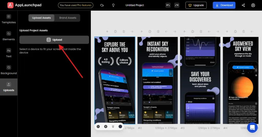
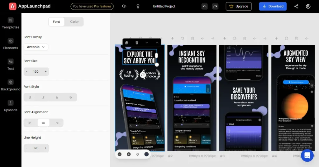
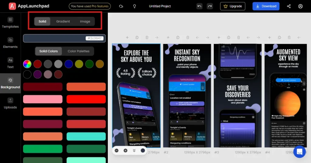
Create ASO optimized screenshots: Step-by-step process
Below is a quick tutorial on how you can create ASO optimized screenshots using AppLaunchpad App Store screenshot generator.
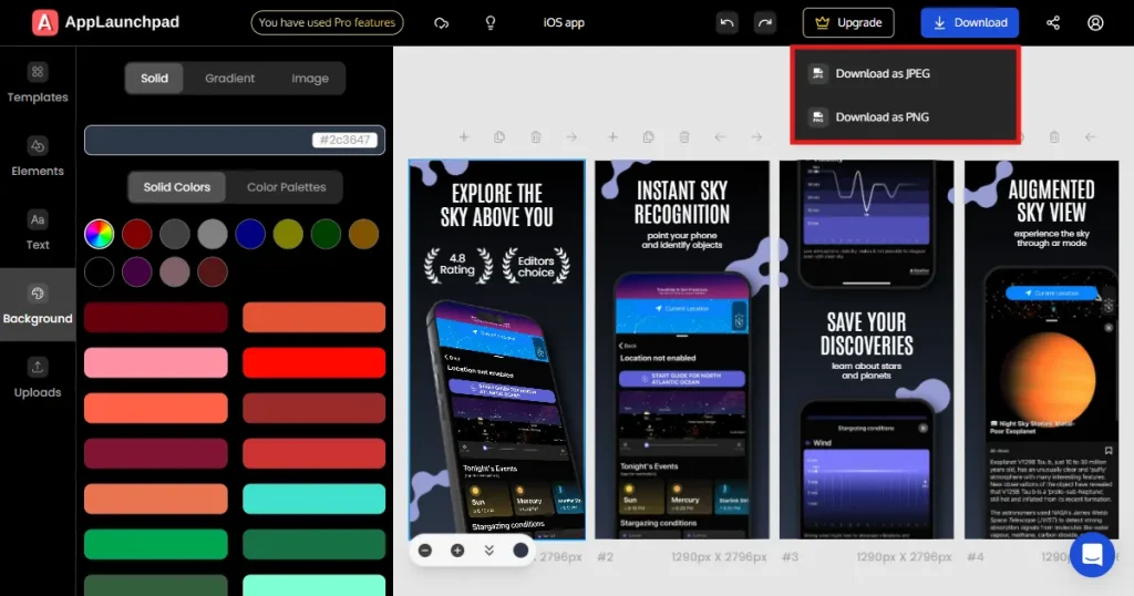
11. Export your finished screenshots in high-quality JPG or PNG format.
Screenshots for utility apps should be simple, reliable, and focused on how the app works. People want to see if the app will quickly solve their problem. Use a clean design, keep text to a minimum, and highlight privacy or security if it matters for your app.
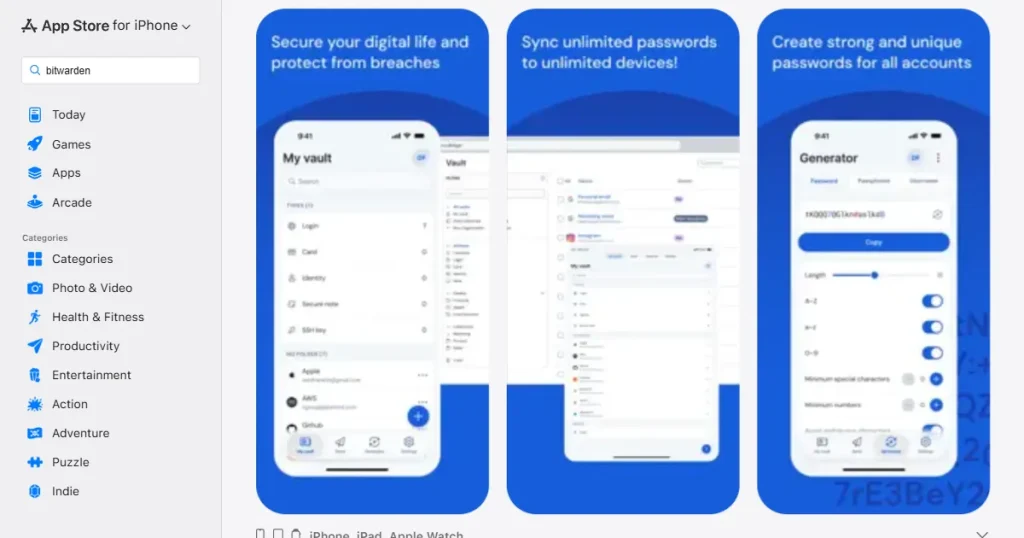
For example, Bitwarden does this well by showing clean, simple screens with short captions that make users feel confident about data security and easy password management.
For finance apps, building trust and showing clear data is most important. Screenshots should highlight charts, clean dashboards, and features that help users feel in control of their money. Showing growth, secure connections, and clear categories can help users feel less anxious about managing their finances.
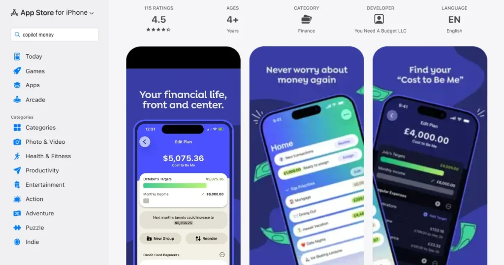
For example, YNAB uses bright, high-contrast dashboards and colorful charts in its screenshots to show that managing money with their app is both easy and visually appealing.
Entertainment apps should focus on selling an experience. Screenshots need to be eye-catching and show off the actual content, like movies, shows, or creators. Use big, bold visuals and keep app interface elements to a minimum so users see what they’ll enjoy.
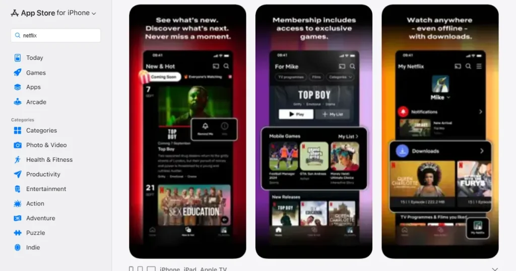
For example, Netflix uses large, cinematic images of its top original shows in its screenshots, quickly reminding users of the great content they can watch.
Screenshots for productivity apps should show how the app fits into daily life. Highlight different ways to use the app, like organizing tasks, working with others, syncing across devices, and using templates. This helps users picture themselves using the app every day.
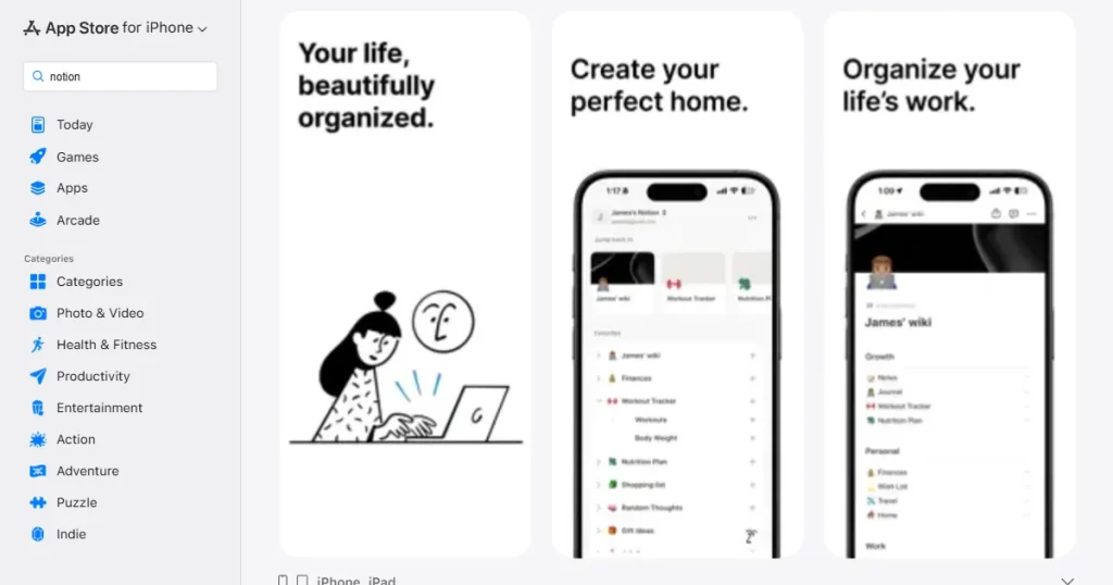
For example, Notion shows clear examples like project boards, meeting notes, and habit trackers in its screenshots, proving how flexible the app is for different needs.
Lifestyle and health apps work best when they connect emotionally and inspire users. Focus on showing results, motivation, and a sense of community. Use photos of real people performing the activity, along with simple UI overlays that show their progress, to encourage users to reach similar goals.
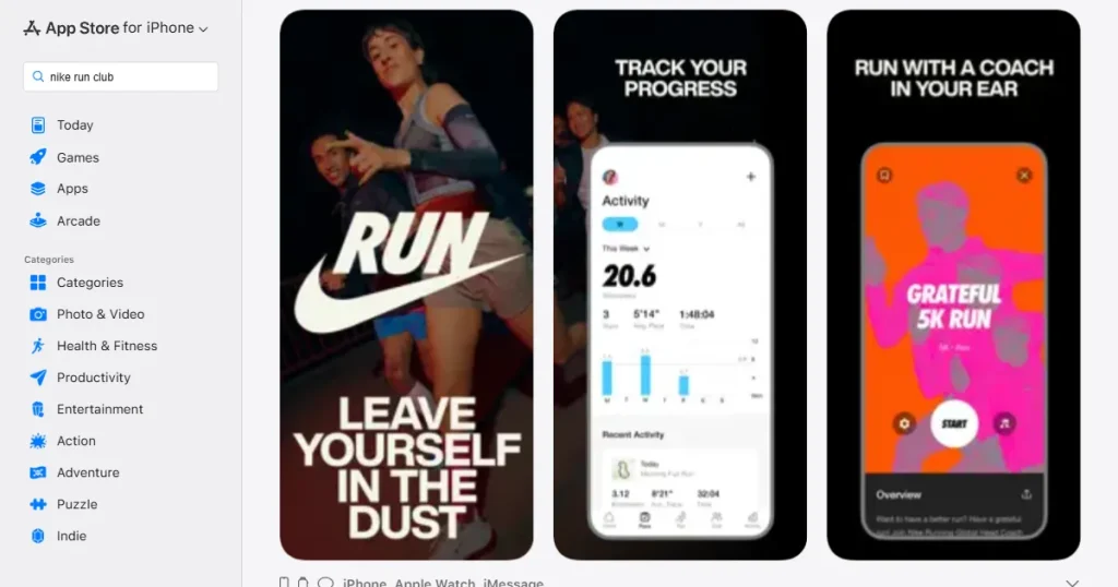
For example, Nike Run Club combines clear tracking stats with inspiring photos of runners, blending the app’s useful features with the fitness craze.
For mobile games, visuals matter most. Use landscape orientation to show more of the game. Screenshots should drop users right into the action, showing colorful graphics, fun gameplay, and rewards. Keep text to a minimum and let the game visuals do the talking.
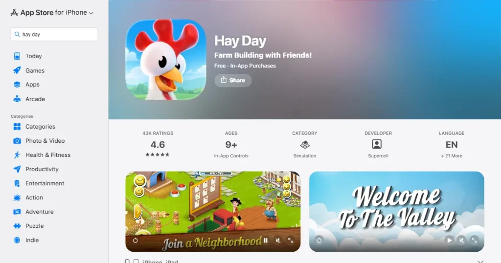
For example, Hay Day by Supercell uses bright, colorful landscape screenshots to show busy farms, fun characters, and clear gameplay, making the game look relaxing and fun.
App screenshots are one of the most powerful tools for App Store Optimization. Focus on clear visuals, strong storytelling, and user benefits to turn screenshots into powerful conversion tools. ASO is an ongoing process, so keep testing and improving your screenshots for long-term growth.
Highlight user benefits, make sure your screenshots are easy to read, and arrange them in a logical order. Most importantly, use A/B testing tools to try different versions and see which ones convert best.
App Store screenshot generators save you time by offering ready-made templates and device frames. They also let you quickly test changes, export in bulk, and easily scale with auto-localization features.
Following the App Store screenshots guidelines is important to prevent launch delays and possible rejections from the review team. To start with, always use the correct size and resolution for each platform. Choose high-quality images, keep text light, and ensure your text stays within safe areas so nothing gets cut off.
Screenshots don’t improve search rankings, but they do significantly affect conversion rates. Good screenshots help users understand and trust your app, so more people who visit your profile will install it.
You can upload up to 10 screenshots per device type on the Apple App Store, and up to 8 screenshots on Google Play.