App Store app icon size requirements
App Store app icon size requirements
Discover essential guidelines for app store app icon size requirements to ensure your icons meet submission standards and attract users
What is an App Store Icon?
An App Store Icon is a small image that represents your app on the App Store. It is the first thing users see when they browse or search for apps. This icon plays a key role in making your app stand out.
The App Store Icon acts like a visual symbol that identifies your app. It shows up in search results, app listings, and on a user’s device after installation. It helps grab attention and gives users a quick idea of what your app is about.
Why App Icon Size Matters
The size of your app icon is important because it ensures that your icon looks good on all devices. Apple has specific size requirements for icons to make sure they appear sharp and clear.
If your icon doesn’t meet these requirements, it could look blurry or pixelated, which might turn users away.
When creating your app icon, you need to think about different screen sizes. The icon must look good on iPhones, iPads, and even in the App Store itself. Each of these places may require a different size.
App icons requirements
App icon size specification for iOS, iPadOS
- Create an app icon that measures 1024x1024 pixels. The system will automatically scale down your 1024x1024 pixel app icon to generate all other required sizes.
- To customize the appearance at specific sizes follow below specifics

MacOS app icon sizes
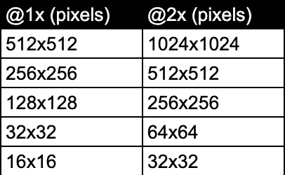
- To meet App Store requirements, your app icon should be 1024x1024 px.
- In addition to the App Store version, you will also need to provide your app icon in these additional sizes.

tvOS app icon sizes

watchOS app icon sizes

App icon Attributes for iOS, iPadOS
Supported format - PNG
Color space - sRGB (color), Gray Gamma 2.2 (grayscale)
Layers - single Your app icon should have only one layer. This means you cannot use complex designs with multiple layers. A single layer keeps things simple and clean, making your icon easy to recognize.
Transparency - no Do not include transparency in your app icon. It should be a solid square without any see-through areas. This makes your icon look more polished and professional.
- Asset shape - square Your app icon must be square. This shape is standard for all app icons on iOS and iPadOS. Make sure your design fits well within a square. This will help your app stand out in the App Store.
Importance of App Store App Icon
1. First Impressions Matter
Your icon is the first thing users notice. Studies show that it takes just 13 milliseconds for the human brain to process an image. A clean, professional-looking icon can make users click on your app, while a poor design can push them away.
2. Conveying Purpose and Personality
Your icon should clearly communicate the app’s function. Whether it's a game, a utility, or a social app, the icon should reflect that. Additionally, it should show the personality of your app—fun, professional, or creative—to connect with your target audience instantly.
3. Enhancing Brand Recognition
A consistent and unique app icon can boost brand recognition. Users are 70% more likely to return to apps they recognize. By using the same icon across different platforms, you increase trust and loyalty, making your app more memorable.
4. Driving User Engagement
A visually appealing icon encourages downloads and frequent use. According to research, apps with attractive icons tend to have higher open rates. This boosts visibility in the App Store and can improve your app's ranking and popularity.
Common Mistakes to Avoid when designing App Icon
1. Using Incorrect Dimensions
One of the most frequent errors is using the wrong size for your app icon. Each platform has specific requirements. For example, iOS app icons must be 1024 x 1024 pixels, while Android icons typically require different sizes like 48 x 48, 72 x 72, and up to 512 x 512 pixels.
Tip: Always check the official App Store App icon guidelines for each platform. This will ensure your icon displays correctly and looks professional.
2. Adding Too Much Detail in Smaller Sizes
When your app icon is displayed in smaller sizes, like on a phone home screen, it becomes hard to see fine details. Users may not be able to recognize your app or understand what it does.
Tip: Keep your design simple. Use bold shapes and colors. Focus on one or two elements that represent your app clearly. This way, even at a small size, users can easily recognize your icon.
3. Overcomplicating the Design or Making It Unclear
A complicated design can confuse users. If your icon has too many elements, it can look cluttered. This may turn potential users away, as they won’t understand what your app is about at a glance.
Tools to create App Icons
- Figma: A versatile tool for designing icons and user interfaces.
- Adobe Illustrator: A professional vector graphics editor for detailed and scalable icon designs.
- Looka: An online tool for generating logo and icon designs.
- Icon Kitchen: A tool to convert your icons into various sizes for different platforms.
- AppLaunchpad - A tool to create professional App Store and Google Play Store screenshots. It also offers a completely free to use App icon generator.

