Google Play Store Screenshot Guidelines
Google Play Store Screenshot Guidelines
Learn the key Google Play Store screenshot guidelines, including best practices for dimensions, formatting, and design to make your app stand out.

You’ve spent months building your Android app. The features work. The crashes are gone. You’re finally ready to ship.
Then you open your Google Play Store listing and realize something important, most people won’t see the work that went into your app. They’ll see your screenshots.
On Google Play, discoverability is crowded and competitive. You don’t get attention just for launching an app. You gradually earn it. And screenshots are often the first thing users see before they even read your description.
If your screenshots are poorly designed or don’t meet Google Play Store policy requirements, your app can be rejected during the review. That means going back, fixing them, and delaying your launch.
To avoid that, we've created this guide to help you walk through the exact Google Play Store screenshot size requirements, device rules, and Google Play Store screenshot optimization tips you need to get it right.
Key Highlights
To get featured on the Google Play Store, apps should provide at least 4 screenshots in 9:16 (portrait) or 16:9 (landscape) at a resolution of 1080px+ or higher. Games must show actual in-game experience.
About 90% of users don’t scroll past the third screenshot, so your first few images carry most of the decision-making weight.
Optimized screenshots can drive around a 24.3% uplift in conversion rate on Google Play, according to ASO research.
Google Play lets you A/B test screenshots through Store Listing Experiments, so you can test what actually improves installs.
Promotional claims like #1, Best, Top, or direct calls to action, such as Install Now are not allowed and can lead to rejection during review.
Google Play Store Screenshot Size Requirements
Your Google Play Store screenshots must reflect the latest version of your app. They need to follow the correct dimensions, supported formats, and aspect ratios required by the Google Play Store.
Google Play Store Screenshots appear in more places than just your listing page. They show up in search results, category pages, and recommendation sections across the Play Store.
Google Play Store Screenshot Dimensions for Major Devices
You can't just upload an endless gallery of screenshots. Google Play Store places strict limits on how many screenshots you can provide per device and what size and aspect ratio they should have.
You have to be strategic with the slots you
| Device Type | Minimum Required to Publish | Maximum Allowed | Supported Formats | Aspect Ratio | Recommended Minimum Size | Maximum Size Limit | Max File Size | Key Notes |
|---|---|---|---|---|---|---|---|---|
| Android Phone | At least 2 (across device types) | 8 | JPEG or 24-bit PNG (no transparency) | 9:16 (Portrait), 16:9 (Landscape) | 1080×1920 (Portrait) or 1920×1080 (Landscape) | Up to 3840px | 8MB | Focus on real UI; first screenshots should clearly show the core value. |
| Tablet (7” & 10”) / Chromebook | 4 recommended | 8 | JPEG or 24-bit PNG (no transparency) | 9:16 (Portrait), 16:9 (Landscape) | Minimum 1080px (short edge) | Up to 7680px | 8MB | Use tablet-specific UI; avoid extra text outside the app interface. |
| Wear OS | 1 | 8 | JPEG or 24-bit PNG (no transparency) | 1:1 | 384×384 minimum | Up to 3840px | 8MB | UI-only; no frames or added backgrounds. |
| Wear OS Watch Faces | 1 | 8 | JPEG or 24-bit PNG (no transparency) | 1:1 | 384×384 minimum | Up to 3840px | 8MB | Show actual watch face variations; no overlays or device frames. |
| Android TV | 1 (if supported) | 8 | JPEG or 24-bit PNG (no transparency) | 16:9 | 1920×1080 minimum | Up to 3840px | 8MB | Should reflect real TV UI experience. |
| Android TV Banner | 1 (required for TV apps) | - | JPEG or 24-bit PNG (no transparency) | 16:9 | 1280×720 (fixed) | Fixed | - | Separate asset; required for TV listings. |
| Android XR (VR/AR Devices) | 4 | 8 | JPEG or PNG | 8:5 | 1920×1200 (min), 3840×2400 recommended | - | 8MB | Designed for immersive apps; show real spatial experience. |
Official Google Play Store Screenshot Format Requirements
Google Play only accepts specific file formats for screenshots. Keep your file sizes under 8MB, and make sure nothing is stretched, skewed, or pixelated.
| Requirement | Details |
|---|---|
| Accepted Format | JPEG or 24-bit PNG files |
| Minimum Resolution | 1080px |
| Minimum Dimensions | 1080x1920 pixels for portrait mode or 1920x1080 pixels for landscape mode |
| Screenshot Ratio | 16:9 for landscape or 9:16 for portrait |
| Number of Screenshots | Minimum 4 and Maximum 8 screenshots |
Understanding Google Play Store Screenshots
Google Play Store screenshots are visual previews of your app’s interface that appear on your listing page. They give users a quick look at how the app works before they decide to install it.
Their main purpose is to help users understand your app's value in just a few seconds. If the benefit is clear, installs go up. If it’s confusing, people will just ignore it without giving it much thought.
While Google Play Store screenshots aren't a direct ranking factor for Google Play search algorithms, the higher conversion rates they bring can indirectly improve your app’s visibility.
Importance of Google Play Store Screenshots
1. First Impressions Matter
Users see your screenshots before downloading your app.
Good screenshots grab attention and create interest.
2. Showcase Key Features
Use screenshots to highlight your app's main features
Demonstrate how your app solves problems or adds value
3. Enhance User Understanding
Provide a visual preview of your app’s interface and functionality.
Help users understand what to expect before they download.
4. Boost App Visibility
Well-designed play store screenshots can improve your app’s ranking.
Google Play Store algorithms consider screenshots in ranking apps.
5. Increase Download Rates
Attractive and informative screenshots can lead to higher download rates.
Users are more likely to download apps with clear and appealing visuals.
6. Build Trust and Credibility
Professional screenshots build trust with potential users.
Users are more likely to trust apps that look polished and well-presented.
Google Play Store Screenshot Guidelines: What’s Allowed and What’s Not?
Your Google Play Store screenshots must focus on the in-app experience without misleading users. Here is exactly what the Google Play Store review team looks for.
What Is Allowed on Google Play Store
Actual In-App Experience: Screenshots must be captured directly from the real app or game.
Stylized compositions: You can use stylized compositions across multiple screenshots, as long as the core UI remains clear, especially in the first three screenshots.
Minimal text: Short text captions can be added as long as they describe key features of the app and occupy no more than 20% space of the screenshot.
Localized Graphics: Screenshot overlay text and messaging can be adapted for different languages and regional markets.
Correct Dimensions: Screenshots must follow Google Play’s required sizes, with an aspect ratio between 16:9 and 9:16, a minimum resolution of 320 px, and a maximum resolution of 3840 px.
Alt Text for Accessibility: Each screenshot should include descriptive alt text (up to 140 characters) for accessibility and screen readers.
What Is Prohibited on the Google Play Store
Human interaction: Don’t include images of people touching the device, unless the core app experience happens off-device.
Unverified claims: You can’t reference Google Play rankings, awards, ratings, or achievements unless they are factual and verified.
Promotional Language: Avoid terms like #1, Best, Top, Discount, Sale, or Million Downloads.
Direct Calls to Action: Phrases such as Download now, Install now, or Play now are not allowed.
Cluttered screenshots: Avoid excessive small text or busy backgrounds that reduce readability.
Outdated offers: Don’t include offers or discount codes that no longer exist, update them or don’t use them at all.
Confidential information: Do not display confidential information, such as service provider names or active notifications, in the status bar of the app.
Low-Quality screenshots: Blurry, stretched, pixelated, or compressed screenshots can lead to rejection.
Unauthorized Branding: Do not show third-party trademarks, device imagery, or Official Google Play Store badges in the screenshots.
Transparent Backgrounds: Transparent images or alpha channels are not allowed, especially for Wear OS screenshots.
Trends of 2026 for App Screenshots on Google Play Store
Background
Bold, Vibrant Colors: Use bright and striking colors to catch attention.
Subtle Textures: Incorporate soft textures to add depth without overwhelming.
Abstract Patterns: Use abstract designs for a modern look.
3D Effects: Apply 3D effects to give a sense of dimension.
Illustrative Elements: Add illustrations to make the background engaging.
Text
Custom Handwritten Fonts: Use fonts that look handwritten for a personal touch.
Geometric Text Designs: Apply geometric shapes to text for a contemporary feel.
Overlapping Text Effects: Layer text elements to create visual interest.
Smooth Typography: Ensure your text is smooth and easy to read.
Text with Shadows: Add shadows to text for better readability and impact.
Device
Original Device: Showcase your app on the actual device model.
Transparent Device Frames: Use transparent frames to focus on the app content.
3D Devices: Include 3D device mockups for a modern look.
Multiple Device Displays: Show your app on various devices to highlight compatibility.
Minimalist Device Outlines: Use simple outlines to keep the focus on the app.
Color
Bold and Vibrant Colors: Use eye-catching colors to stand out.
Monochromatic Schemes: Employ different shades of a single color for a cohesive look.
Earthy and Natural Tones: Use natural colors for a calm and grounded appearance.
Pastel Palettes: Choose soft pastel colors for a gentle, appealing look.
High-Contrast Combinations: Use high-contrast color combinations for better visibility.
Muted Colors: Apply muted tones for a sophisticated and subtle effect.
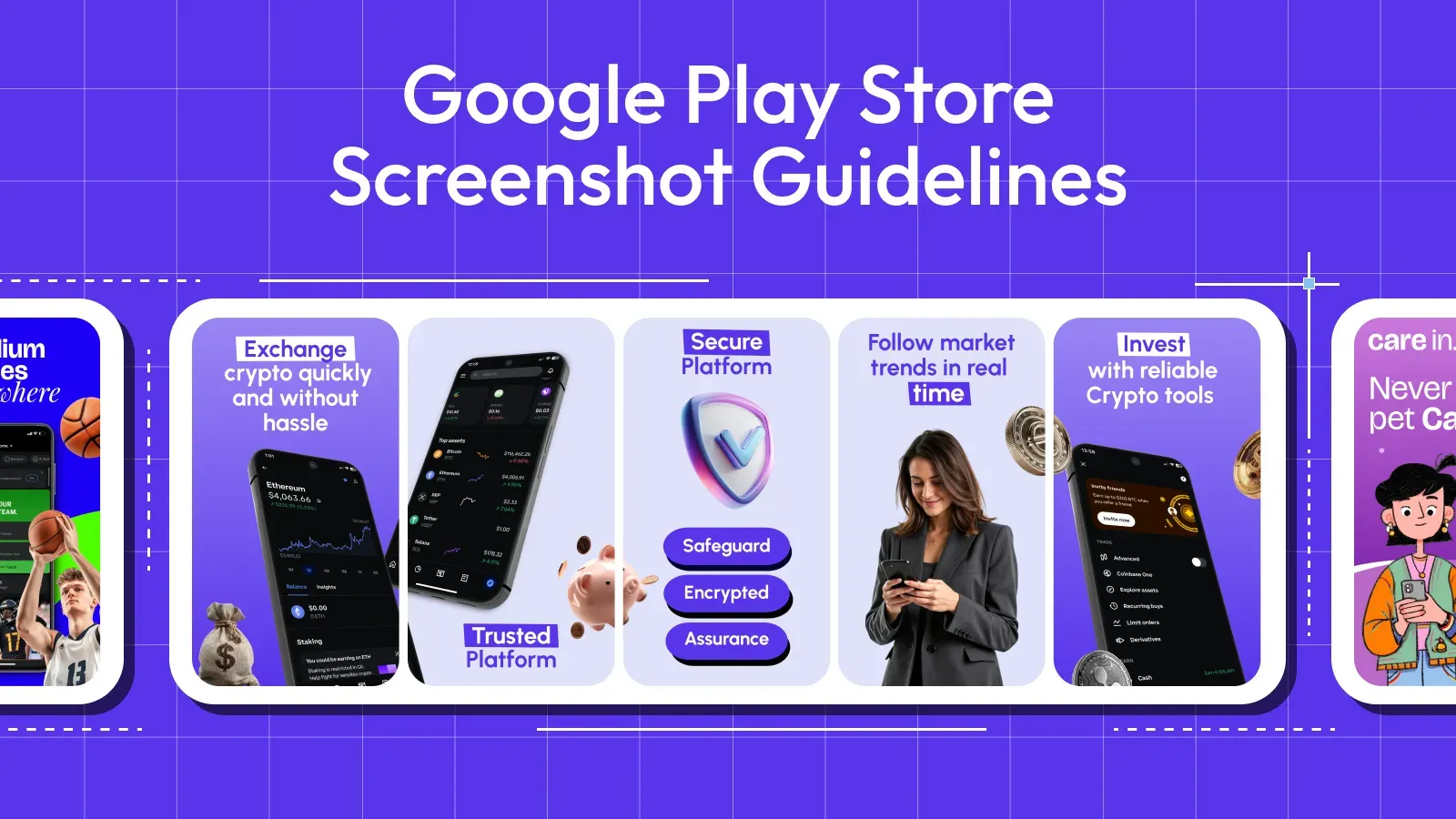
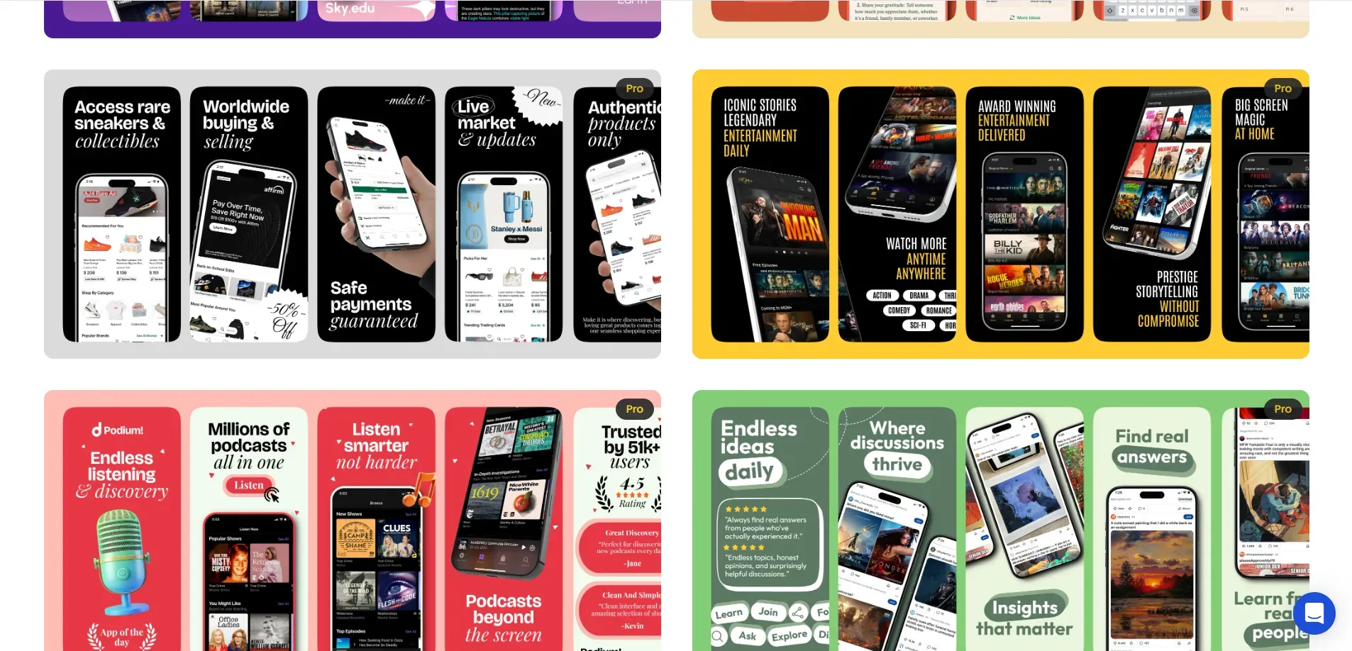
Top 5 High-Converting Google Play Screenshot Examples
Here are five real-life app examples which are using their Google Play Store screenshots effectively.
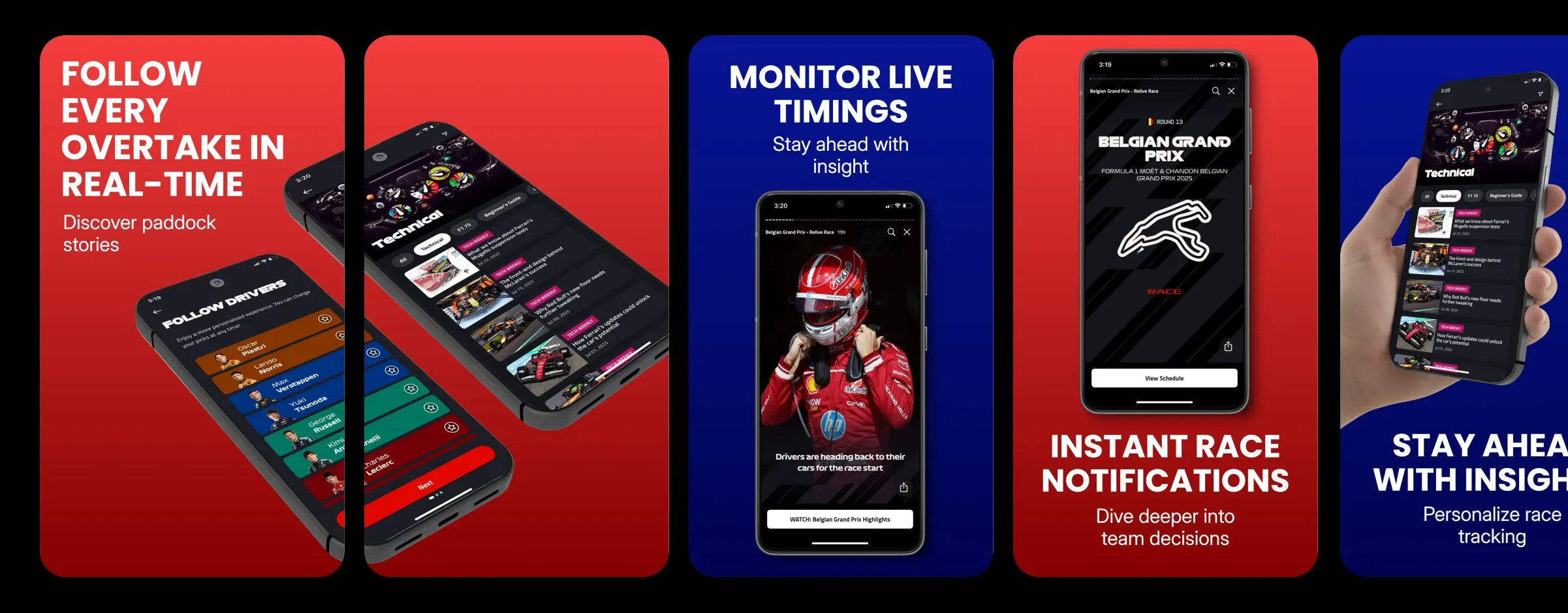
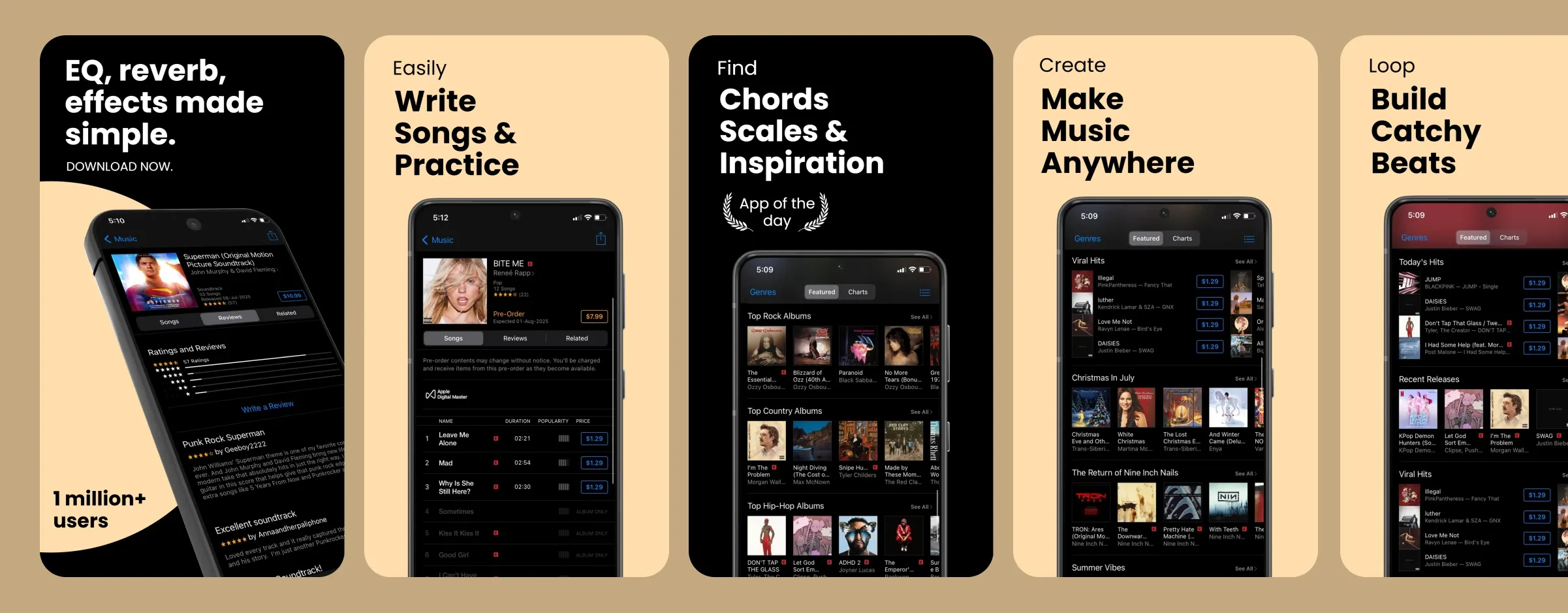
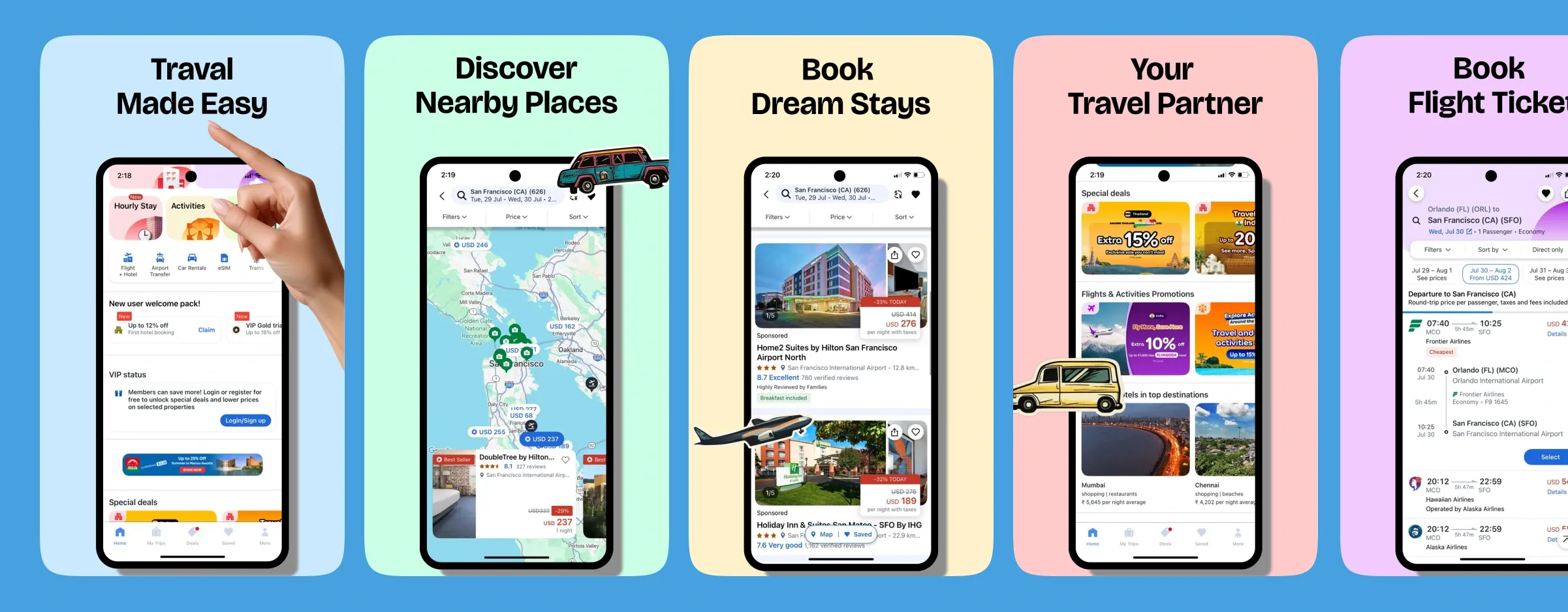
Candy Crush Saga
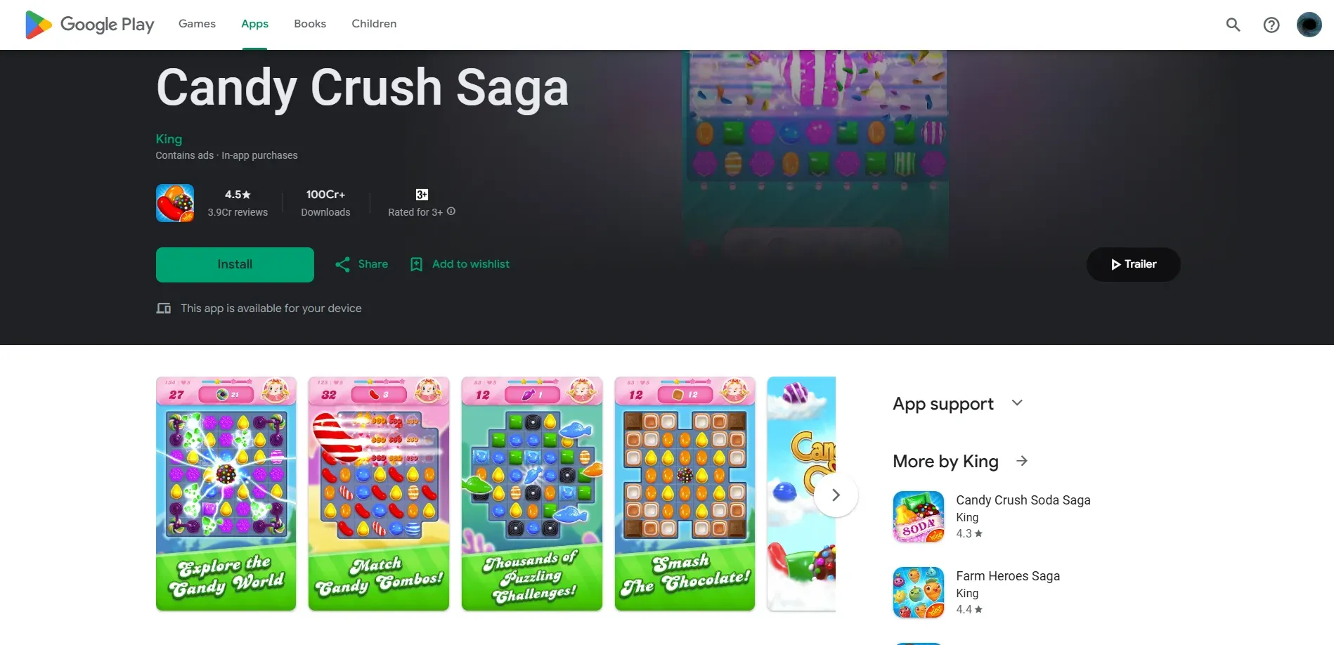
Candy Crush Saga shows the in-app game experience directly. You can immediately understand what the app offers. The UI looks clear, text captions are minimal, and thebright colors naturally draw attention to the screen.
Instagram features clean and uncluttered screenshots focusing on the main outcome of the app. The screenshots highlight key features like Reels, DMs, and Stories without adding unnecessary graphics or fancy fonts. The interface speaks for itself.
Duolingo
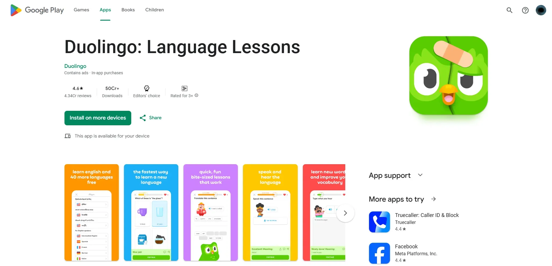
Duolingo uses bold, benefit-driven screenshot headlines that are easy to read and understand. The layout provides clean spacing around the UI, and the branding remains consistent across all screenshots.
Blinkit
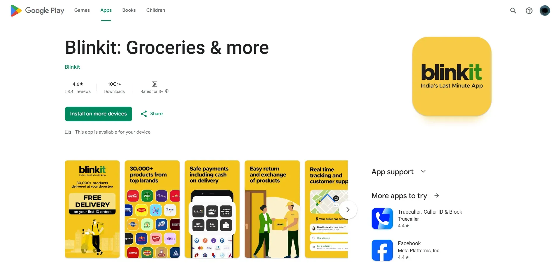
Blinkit’s screenshot messaging focuses on the main outcome of the app “Groceries in minutes”, It’s direct and practical. Each screenshot shows a real use case with a clear visual hierarchy.
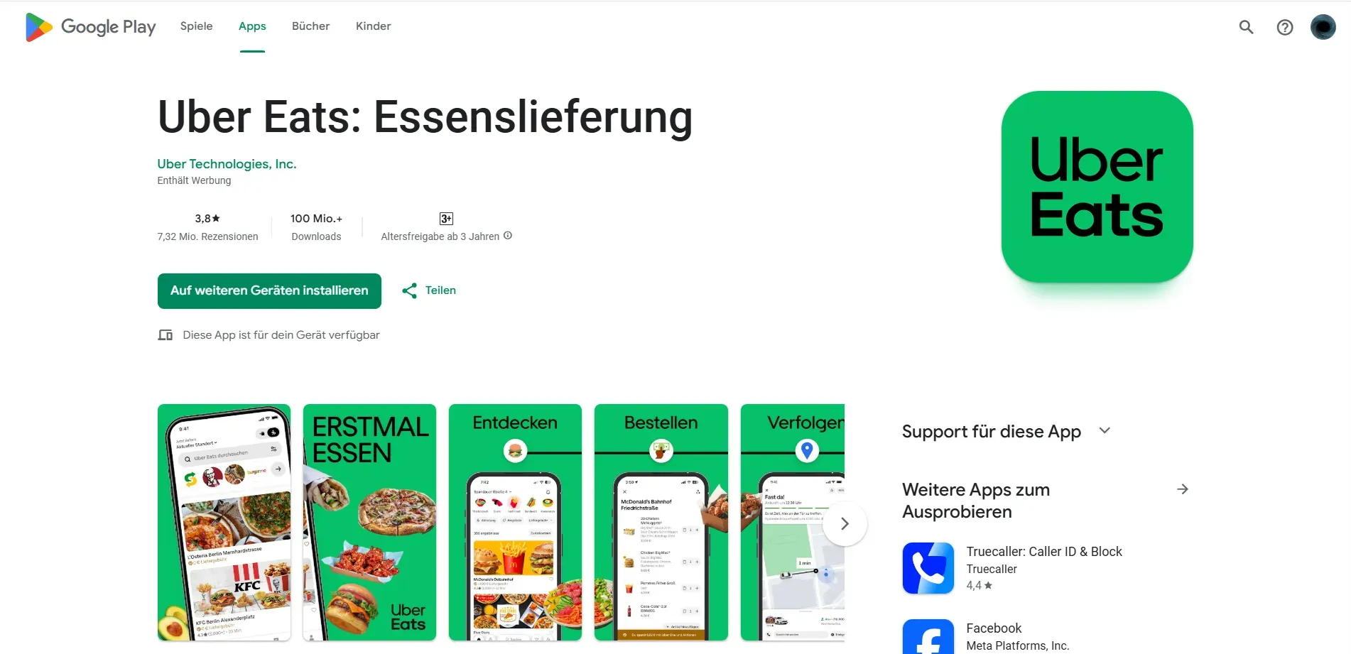
Uber
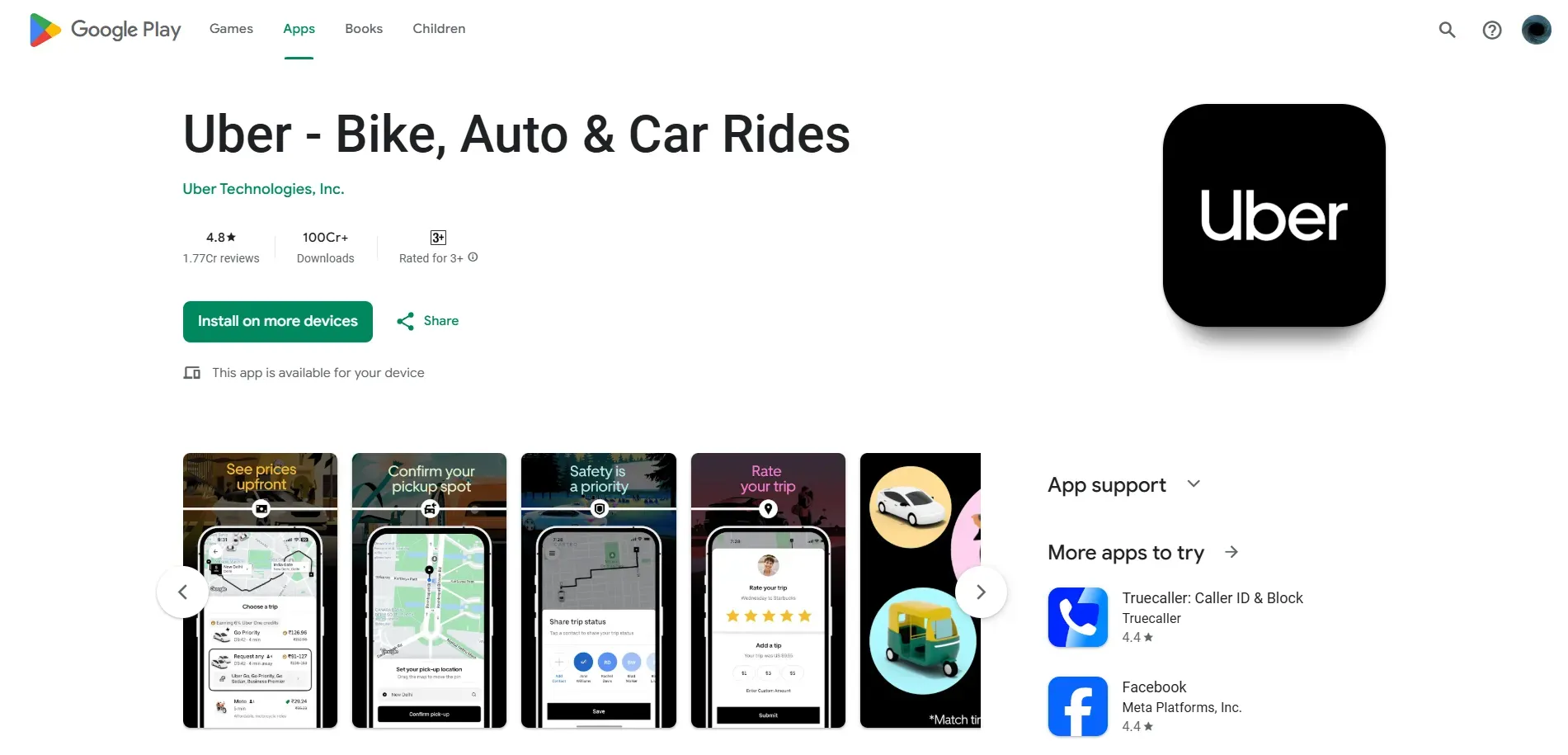
Uber walks users through the natural app flow like a story. The captions are short and benefit-focused, making the process feel simple without adding extra explanation.
Best practices for Play Store screenshot dimensions and conversion
Following the technical rules helps you pass the review. But installs depend on how clearly you communicate your app's value.
Create Google Play Store screenshots, keeping these best practices in mind.
Show Your Core Value Proposition in the First Two Screenshots
You have only a few seconds to hold the user’s attention. Your main benefit should be obvious right away.
Use outcome-driven headlines that highlight a specific result. Avoid generic phrases that don’t explain what the app actually does.
If you’re building a health app, for example, don’t lead with a generic dashboard. Show the most important and key features of your app first, so users immediately understand why the app is useful.
Keep Text Short, Bold, and Instantly Readable
Stick to one clear headline per screenshot, as no one is going to read through a big paragraph.
Use a strong contrast between the text and the background so it’s easy to read at a glance. If users have to squint their eyes, they’ll most likely move on. Remember that taglines cannot occupy more than 20% of your screenshot. Make every word earn its space.
Design for Mobile Viewing with Clear Visual Hierarchy
Keep the app interface as the main focus. Your screenshot background should support the UI, not distract from it.
Use clear spacing and alignment to guide the user’s eye from the headline to the app interface. Leave enough margin around the edges so text and important elements don’t get cropped on smaller screen sizes.
Highlight Real In-App Screens
Capture screenshots from your current live app build. Over-designed mockups that don’t match the real app UI can create confusion.
Show actual user flows such as browsing on the app, completing an action, and seeing the result. That’s what people want to understand. Before taking a screenshot, clear the notification bar. Remove alerts and make sure system icons look standard and polished.
Maintain Consistent Branding
Use the same color palette and typography across your entire screenshot set. Consistency makes everything easier to scan.
Your screenshot style should match your app icon so the entire Play Store listing feels consistent and cohesive.
Consistency makes your brand look professional and trustworthy.
Use Strong Contrast to Highlight Key Features
Use gradients or subtle backgrounds to help the UI stand out. The focus should always stay on the app screen.
Avoid busy visuals that compete with the text captions or the interface. If users have to figure out what to look at, they won’t.
Lastly, check your Google Play Store screenshots at different brightness levels to make sure the UI and text remain clear and readable.
Localize Screenshots for Key Markets
Localizing screenshots isn't just about translation. It's about making the message relevant to local audiences.
Make sure longer text translations(e.g., German or Japanese) don’t break your carefully designed screenshot layout. Always test your localized screenshot sets in the Google Play Console Experiments to see which perform better in each market.
What Gets Screenshots Rejected in Google Play Console Reviews
Rejections usually happen because of small, avoidable mistakes. Here are the most common ones.
Wrong Device Category: Uploading Android phone screenshots under tablet, TV, Wear OS, or XR sections without meeting their specific size and ratio rules.
Missing Required Screenshots: Not providing the mandatory screenshots for certain devices, such as Android TV (minimum 1 screenshot) or Android XR (4 to 8 screenshots).
Incorrect Aspect Ratio: Ignoring strict format requirements such as 1:1 aspect ratio for Wear OS or 8:5 for Android XR.
Low Resolution: Using low-resolution screenshots that don’t meet the minimum size requirements, especially for large-screen devices, such as tablets/Chromebooks.
Screenshots Don’t Match the Live App: Submitting screenshots that show outdated app UI, removed features, or designs not present in the actual app.
Low Image Quality or Export: Uploading blurry, stretched, rotated, or transparent images that don’t meet Google Play Store technical standards for screenshots.
Advanced Google Play Store Screenshot Optimization Strategies
Once your screenshots meet the technical requirements, the next step is to improve their conversion rate.
Run Screenshot A/B Tests: Use Google Play Console Experiments to test multiple screenshot sets and see which version actually increases installs.
Let Data Guide Design Choices: If a text headline or layout performs better, use it across your listing instead of relying on personal preference.
Create Tablet-Optimized Screenshots: Don’t use Android phone screenshots for tablets. Create layouts designed for larger screens so they can take full advantage of tablet displays.
Align Screenshots with Your Ads: If your ad highlights a specific benefit, make sure your screenshots show the same thing so users see consistency after they click.
Design for Each Device Type: TV, Wear OS, and XR users interact differently, so tailor your visuals to reflect how the app is actually used on each device.
Complete Toolkit for Google Play Store Creatives and Metadata Optimization
You don't have to build everything from scratch. There are tools designed to make this process much easier.
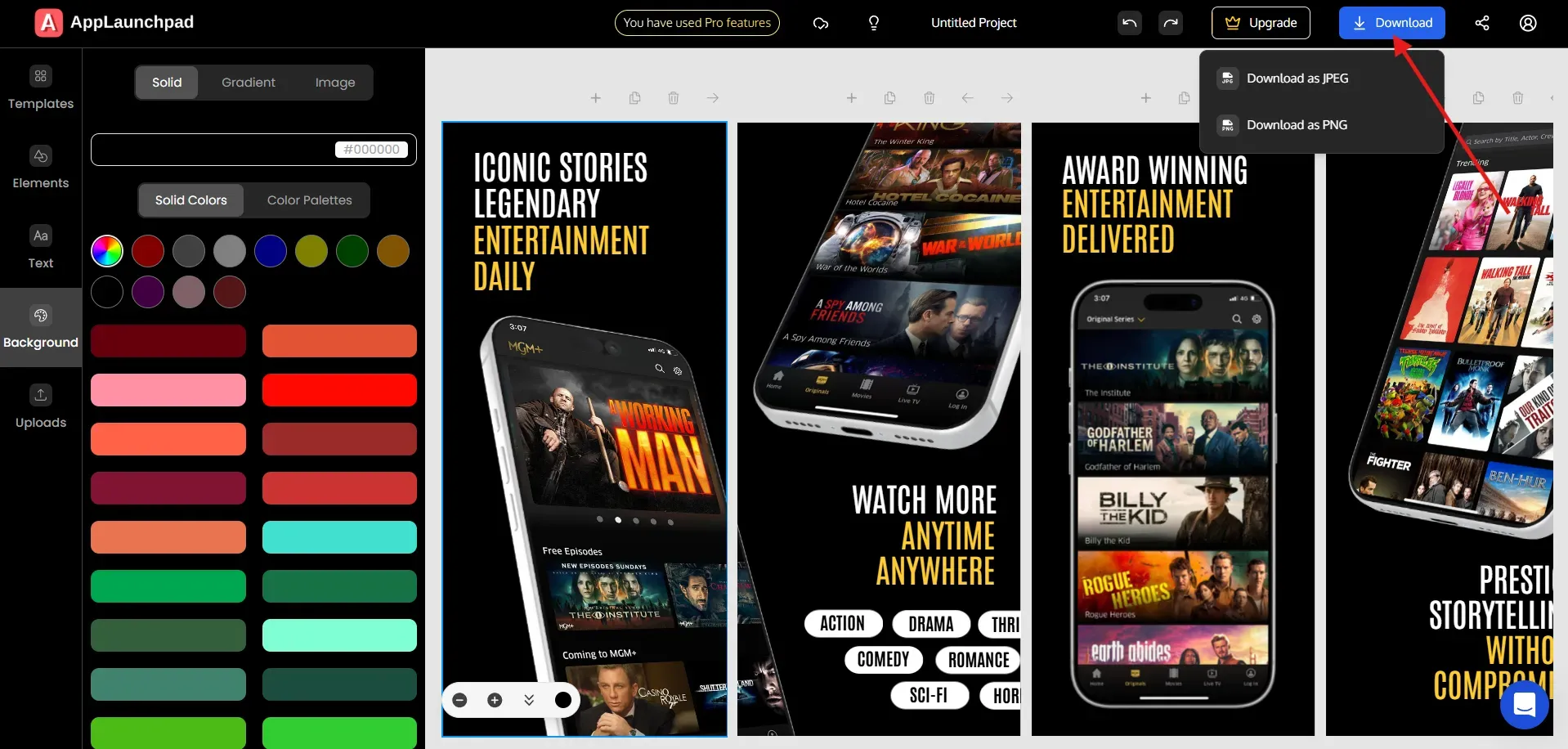
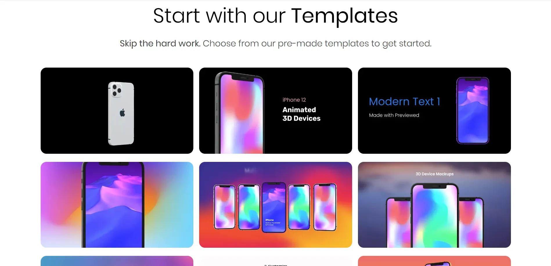
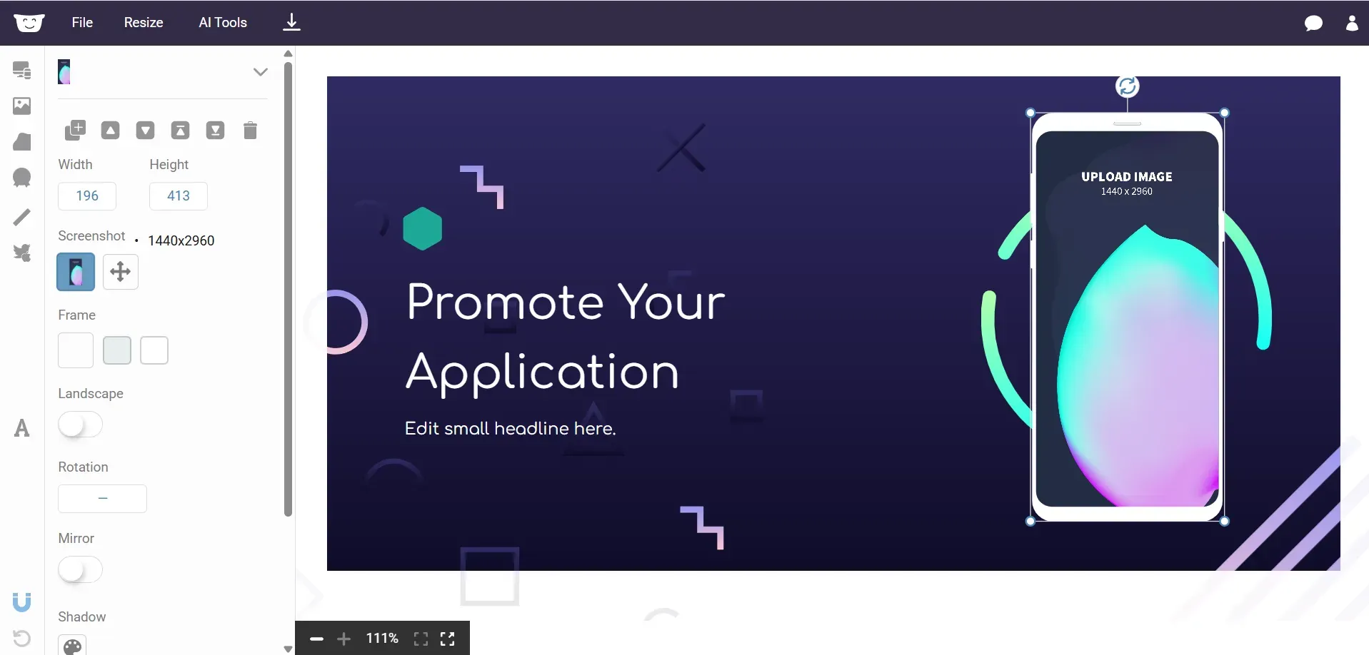
AppLaunchpad
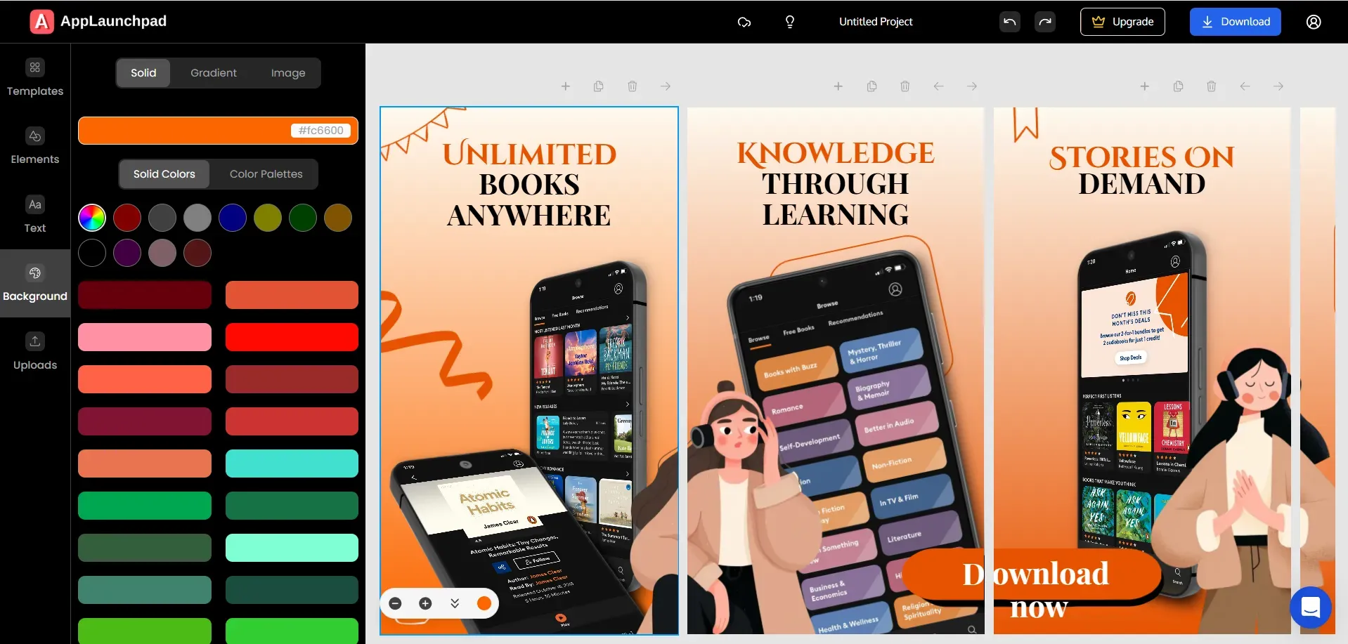
AppLaunchpad helps you create compliant Google Play Store screenshots without worrying about dimensions or aspect ratios. You can use ready-made templates, generate device mockups, and create localized versions for different markets. It’s built to save time while keeping your visuals within Google Play Store rules.
Create Google Play Store screenshots on AppLaunchpad: Step-by-step instructions
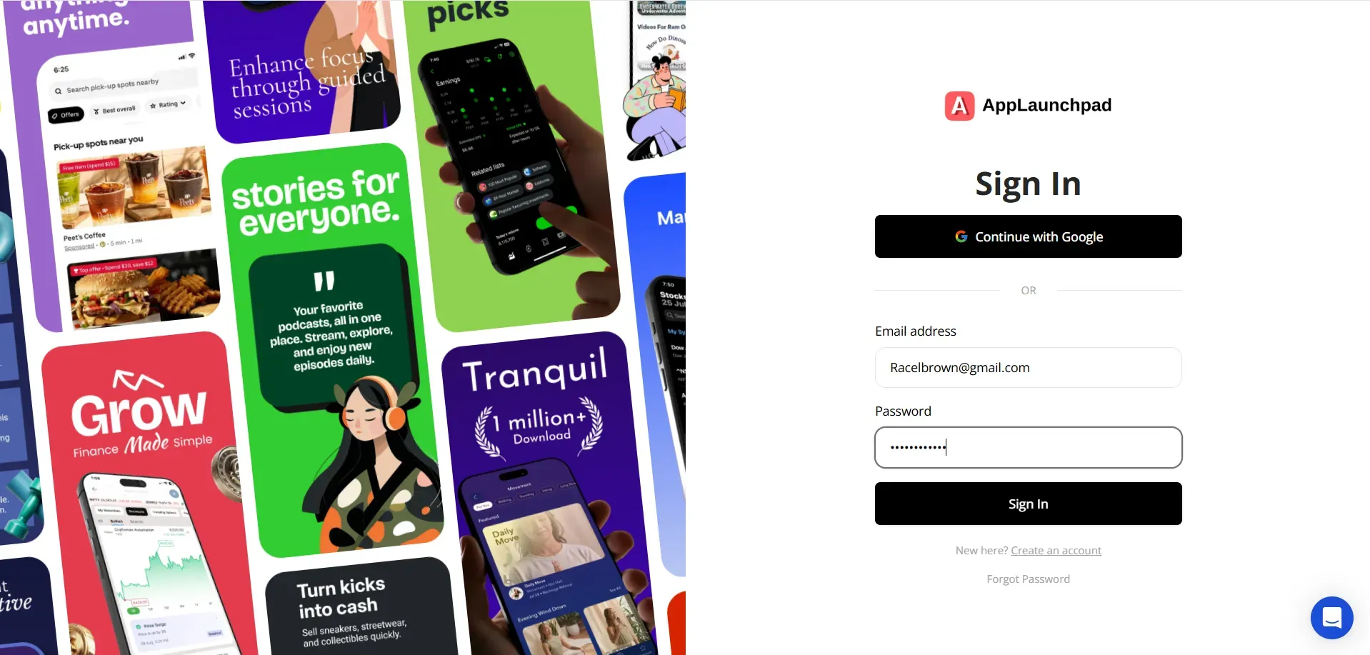
Step 1: Visit AppLaunchpad and Sign up with Google or Email. If you already have an account, log in with your saved credentials.
Step 2: Select an Android phone from the device list. This will show you screenshot templates for Android phones only.
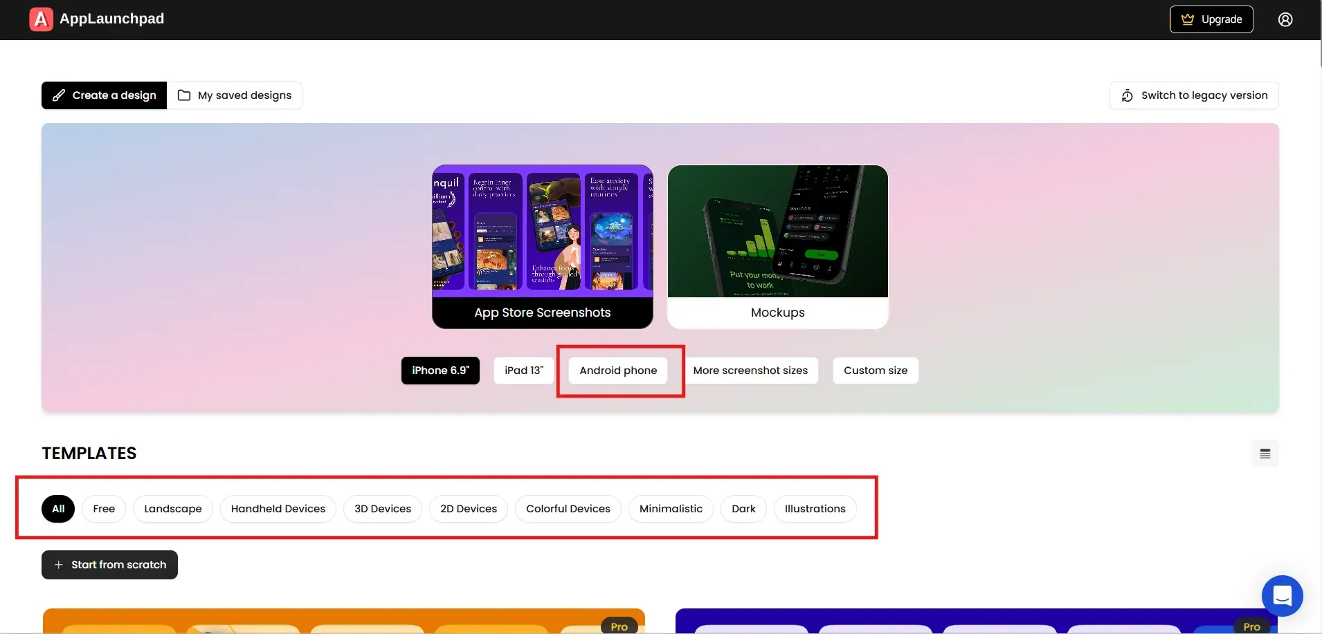
Step 3: Select a screenshot template of your choice.
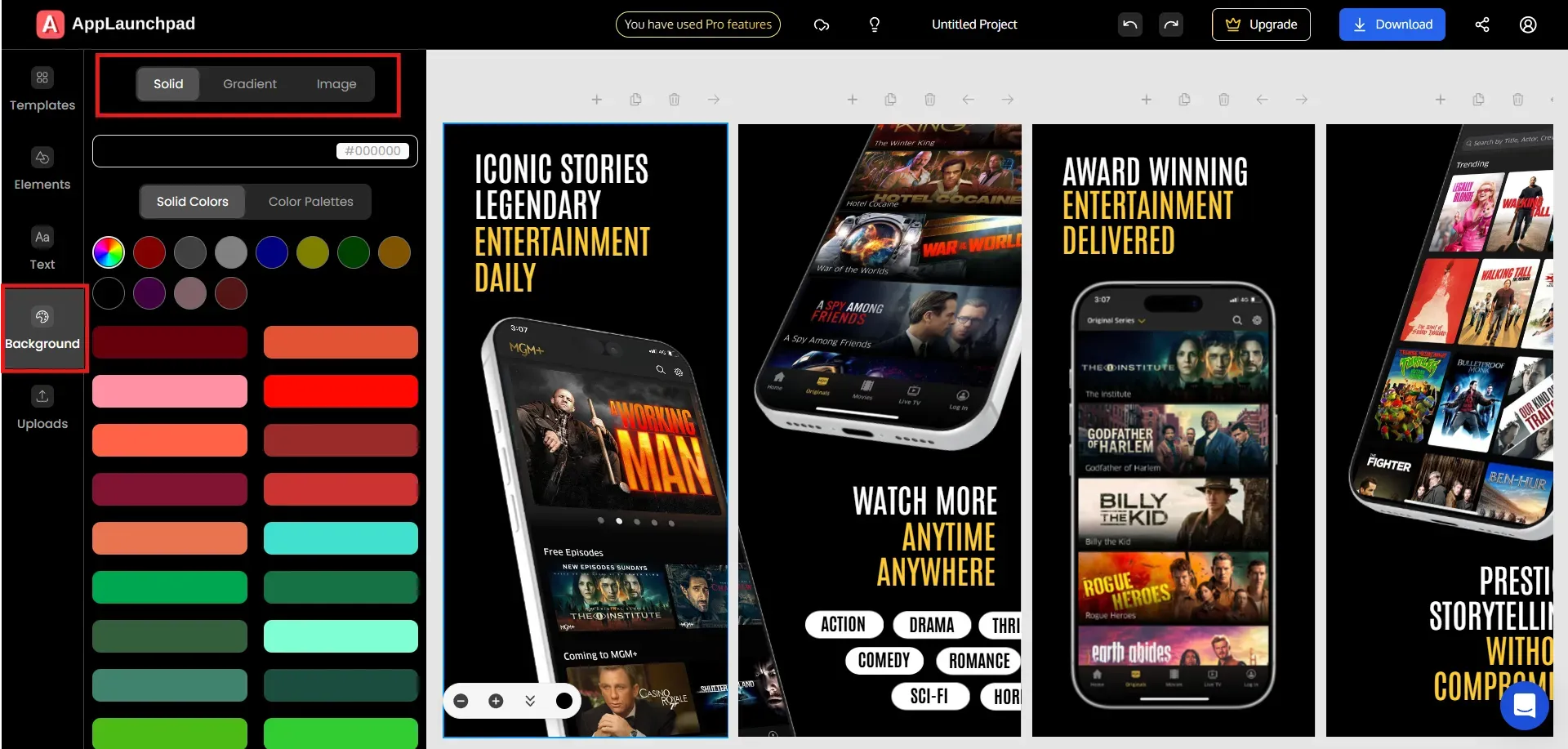
Step 4: Upload the app UI screens, add them to the device frames.
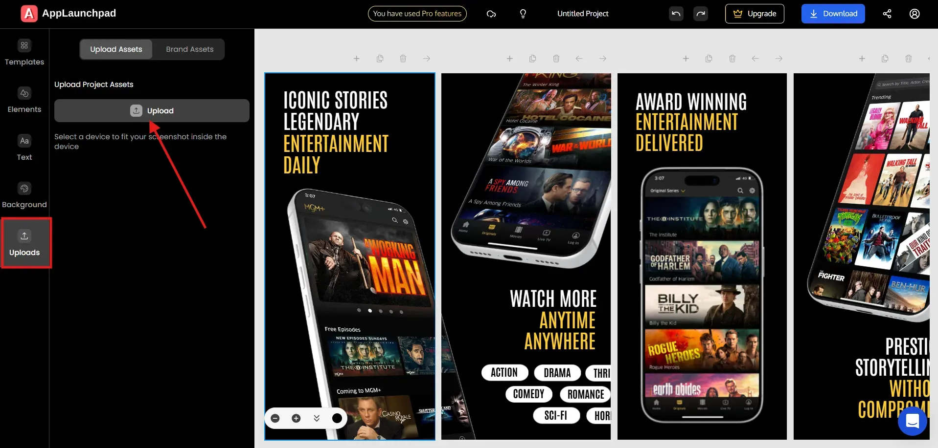
Customize the text captions.
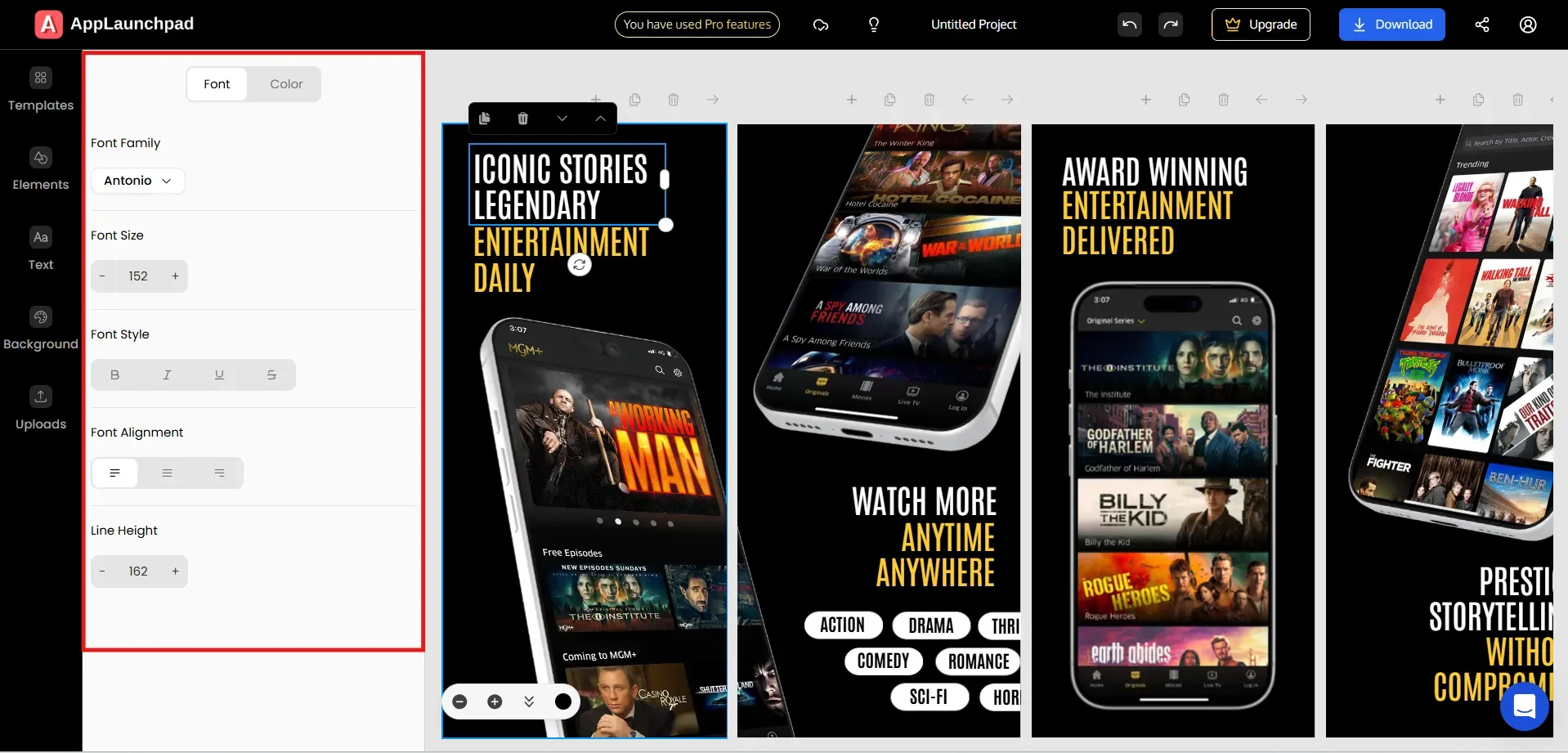
Change the background color (if needed).
Step 5: Download final Google Play Store screenshots in JPEG or PNG format.
Previewed
Previewed is useful for creating Play Store preview videos and animated app demonstrations. It helps you showcase how your app works without needing advanced video editing skills.
VisualKit App Icon Generator
VisualKit helps you design Play Store-ready app icons that follow the official Google Play Store screenshot guidelines for shape, grid, and shadow of app icons.
Hotpot.ai
Hotpot AI can be used to create feature graphics and promotional visuals formatted correctly for your Google Play Store listing header.
App Description Generator (Feedough)
Feedough helps you draft optimized Google Play Store listing titles and descriptions so your written metadata aligns with your screenshots and overall app positioning.
Final Conclusion
Your Google Play Store screenshots aren’t just visuals. They shape how users judge your app in the first few seconds. Following Google Play Store screenshot guidelines ensures your app gets approved without delays. That’s the starting point.
After that, focus on clarity. Show the core benefit quickly. Keep the messaging consistent. Localize where it makes sense. Test what works. Improve what doesn’t. That’s how you build steady growth on the Play Store.
Quick Upload Checklist
UI Accuracy: Make sure every screenshot reflects the exact version of the app you’re submitting to Google Play.
Device Compliance: Confirm that each screenshot follows the correct dimensions and aspect ratio for its device category.
Format & Export: Verify that all files are JPEG or 24-bit PNG (no transparency) with proper orientation.
Policy Review: Double-check that there are no prohibited claims in your screenshots, like “#1,” “Best,” pricing promotions, or direct calls to action.
Readability Check: Ensure screenshot captions are clear, concise, and don’t overpower the app's UI.
At last, look at the first three screenshots and ask yourself, can a new user understand what your app does within a few seconds?
FAQs
1. How do I generate screenshots for the Google Play Store?
Capture real screens from your app’s latest build. Visit AppLaunchpad, select a template, upload the captured app screens and add short, clear headlines where needed, change the background color if you are looking for some change. Lastly, export the final sreenshots as JPEG or 24-bit PNG and upload them to your Google Play Store listing.
2. Can I add custom elements to my Google Play Store screenshots?
Yes, you can use custom backgrounds or short taglines, as long as they aren’t misleading. Just be careful, don’t make promotional claims, and don’t hide the app's actual interface.
3. Do I need design experience to use AppLaunchpad for Play Store screenshots?
No. AppLaunchpad gives you preset dimensions and Google Play Store screenshot templates, so you can create compliant screenshots without advanced design skills.
4. How many screenshots can I upload to Google Play?
You can upload up to 8 Google Play Store screenshots per supported device type. At least two screenshots across device types are mandatory to publish your listing.
5. What file formats does Google Play accept for screenshots?
Google Play accepts only JPEG and 24-bit PNG screenshots. Transparency or alpha channels are not allowed.